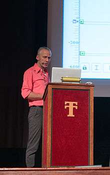
Luc(as) de Groot
| Luc(as) de Groot | |
|---|---|
 De Groot in 2013 | |
| Born |
June 21, 1963 Noordwijkerhout, the Netherlands |
| Nationality | Dutch |
| Occupation | Type designer |
| Known for |
Thesis Calibri |
Lucas de Groot (born 21 June 1963 in Noordwijkerhout, the Netherlands), known professionally as Luc(as) de Groot, is a Dutch type designer.[1] He is the head of the type foundry Fontfabrik, also trading as LucasFonts.[2]
De Groot is particularly known for the very large family Thesis (a font superfamily with sans-serif, serif and monospaced designs), Calibri, the longtime default font with Microsoft Office, and Consolas.[3][4][5] De Groot is considered an expert on using interpolative font design and stylistic alternates to develop large families with a wide range of features and languages supported.[6][7]
Biography
De Groot was born in the Netherlands and studied at the Royal Academy of Arts in The Hague. He adopted the name Luc(as) on his business card after graduating as a reference to people calling him by both names.[8] After having worked for a few years at Amsterdam-based design agency BRS Premsela Vonk (since 2009 called Edenspiekermann), De Groot moved to Berlin to work at MetaDesign under Erik Spiekermann. Some of his early work included alternative versions of Frutiger, which much of his work is influenced by.[9] While working at MetaDesign he began working on the Thesis family in his spare time, a project he described as being enabled by a lack of personal connections outside work.[10] Thesis was initially published by Spiekermann's FontShop library before he established an independent company.
De Groot's work includes commercially released fonts and also custom families for particular clients: Corpid (previously AgroSans) for the Dutch Ministry of Agriculture; SunSans for Sun Microsystems; SpiegelSans and Taz for, respectively, the German magazines Der Spiegel[5] and die tageszeitung; and FolhaSerif for the Brazilian newspaper Folha.[11] Some of these such as Taz have since become publicly available.[12]
De Groot teaches at the Design Faculty of the Fachhochschule Potsdam (University of Applied Sciences, Portsdam) in Potsdam, outside Berlin.[13][14]
Fonts
Major fonts by de Groot include:
- Thesis: contains the sans-serif TheSans, TheSans Mono and serif designs TheMix and later TheAntiqua[15]
- Taz for the newspaper die Tageszeitung
- FolhaSerif
- SunSans, for Sun Microsystems
- Calibri, for Microsoft
- Consolas (2004, released 2007), for Microsoft
- Spiegel[16]
As an amusement, de Groot also developed a number of parodic, spiky or distorted reworkings of Thesis, including Nebulae and JesusLovesYouAll.[17]
References
- ↑ Tselentis, Jason; Haley, Allan; Poulin, Richard (1 February 2012). Typography, Referenced: A Comprehensive Visual Guide to the Language, History, and Practice of Typography. Rockport Publishers. p. 91. ISBN 978-1-61058-205-6.
- ↑ Macmillan, Neil (2006). An A-Z of Type Designers. Yale University Press. p. 97. Retrieved 17 September 2011.
- ↑ Misjel Vossen (2008). Goed voor druk. Academia Press. p. 57. ISBN 978-90-382-1225-8.
- ↑ Jürgen Gulbins; Christine Kahrmann (8 March 2013). Mut zur Typographie: Ein Kurs für Desktop-Publishing. Springer-Verlag. p. 97. ISBN 978-3-642-57294-4.
- 1 2 Garfield, Simon. Just My Type: A book about fonts. p. 329. Profile Books (UK), Gotham Books (US), 2010, pp.328-331. ISBN 978-1-59240-652-4.
- ↑ Hardwig, Florian. "Jazz In Town poster". Fonts In Use. Retrieved 12 May 2016.
TheSans is a well-equipped font, featuring Ǖ, Ǘ, Ǚ and Ǜ, Vietnamese small-caps, six alternative ampersands and many more cool extras.
- ↑ Biľak, Peter. "Family planning, or how type families work". Typotheque. Retrieved 12 May 2016.
- ↑ "The Typographic Times | [Interview with Lucas de Groot]". Planet Typography. September 2008. Retrieved 2015-10-09.
My full name is Lucas Adrianus Wilhelmus de Groot, my calling name is Luc (officially printed on my birth announcement!). When I was young, some people called me Luc, others Lucas. I wasn’t aware of the difference until I had to design my business card in school, then I came with this solution: Luc(as).
- ↑ Osterer, Heidrun; Stamm, Philipp; Frutiger, Adrian (8 May 2014). Adrian Frutiger – Typefaces: The Complete Works. Birkhäuser. pp. 256, 429. ISBN 978-3-03821-260-7.
- ↑ Jan Middendorp (2004). Dutch Type. 010 Publishers. pp. 219–227. ISBN 978-90-6450-460-0.
- ↑ Knecht, Sonja. "Taz Wide & Extended". Slanted. Retrieved 15 May 2016.
- ↑ Luecke, Karsten. "Taz update 3 review". Typographica. Retrieved 11 July 2015.
- ↑ "Herr Prof. Lucas de Groot". Fachhochschule Potsdam. Retrieved 13 May 2016.
- ↑ Vogt, Constanze; Beyrow, Mathias. "Der ABC-Macher". Sabine. Fachhochschule Potsdam. Retrieved 15 May 2016.
- ↑ Lo Celso, Alejandro. "Serial Type Families" (PDF). University of Reading (thesis). Archived from the original (PDF) on 2014-11-08.
- ↑ Coles, Stephen. "Top Ten Typefaces Used by Book Design Winners". FontFeed. Retrieved 2 July 2015.
- ↑ "FontFabrik Type". FontFabrik. Retrieved 7 July 2015.
External links
- Lucas de Groot home page
- LucasFonts Lucas de Groot's design bureau.