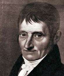
Justus Erich Walbaum

.png)
Justus Erich Walbaum (25 January 1768 – 21 June 1837) was a prominent German typefounder and punchcutter of the late 18th and early 19th centuries.[1][2][lower-alpha 1]
Walbaum was a punchcutter, who carved steel punches used as a master to stamp matrices, the moulds used to cast metal type.[4] Walbaum was born in Steinlah, a district of the town of Haverlah in modern Lower Saxony. Based first in Goslar and later in Weimar, he created type in the Didone style, also known as the 'rational' or 'modern' style. This style, inspired by the work of type designers such as the Didot family and Giambattista Bodoni, involved a sharper contrast between thick and thin strokes than was used previously, and a more modulated design. Jan Tschichold described his designs as 'the most beautiful German version' of modern type.[5][6] He also created type in the Fraktur style of blackletter.[7]
Walbaum's style of type was influential in his lifetime and the following century. It became less popular in the twentieth century due to a change in taste which preferred 'old-style' serif letterforms, based on printing before the nineteenth century. However, his work has remained popular, particularly in Germany, and revivals have been created by Monotype, Linotype, Berthold and others in the twentieth century, and by František Štorm more recently.[8][9][10][11]

While he did not create type in the style, the basic structure of his letterforms has been suggested as an influence on early sans-serif typefaces of the nineteenth century and those inspired by them, such as Akzidenz-Grotesk, Univers and Helvetica.[12]
References
- ↑ Alexander S. Lawson (January 1990). Anatomy of a Typeface. David R. Godine Publisher. pp. 202–8. ISBN 978-0-87923-333-4.
- ↑ Walter Steiner; Uta Kühn-Stillmark (January 2001). Friedrich Justin Bertuch: ein Leben im klassischen Weimar zwischen Kultur und Kommerz. Böhlau Verlag Köln Weimar. pp. 77–84. ISBN 978-3-412-11097-0.
- ↑ Christina Killius (1999). Die Antiqua-Fraktur Debatte um 1800 und ihre historische Herleitung. Otto Harrassowitz Verlag. pp. 24, 459. ISBN 978-3-447-03614-6.
- ↑ "The Invention of the Printing Press". French Ministry of Culture. Retrieved 3 December 2015.
- ↑ Jan Tschichold (1995). Treasury of Alphabets and Lettering: A Source Book of the Best Letter Forms of Past and Present for Sign Painters, Graphic Artists, Commercial Artists, Typographers, Printers, Sculptors, Architects, and Schools of Art and Design. Norton. pp. 232–3. ISBN 978-0-393-70197-5.
- ↑ Simon Garfield (1 September 2011). Just My Type: A Book About Fonts. Penguin Publishing Group. p. 232. ISBN 978-1-101-57781-3.
- ↑ Yannis Haralambous; P. Scott Horne (28 November 2007). Fonts & Encodings. "O'Reilly Media, Inc.". p. 394. ISBN 978-0-596-10242-5.
- ↑ Tova Rabinowitz (1 January 2015). Exploring Typography. Cengage Learning. p. 107. ISBN 978-1-305-46481-0.
- ↑ "Walbaum MT". MyFonts. Monotype. Retrieved 29 February 2016.
- ↑ "Walbaum LT". MyFonts. Linotype. Retrieved 29 February 2016.
- ↑ Štorm, František. "Walbaum 2010". MyFonts. Stormtype. Retrieved 29 February 2016.
- ↑ Majoor, Martin. "My Type Design Philosophy". Typotheque. Retrieved 12 November 2015.