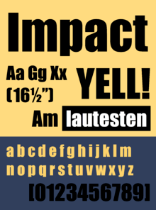
Impact (typeface)
 | |
| Category | Sans-serif |
|---|---|
| Classification | Realist |
| Designer(s) | Geoffrey Lee |
| Foundry | Stephenson Blake |
| Date created | 1965 |
| Variations | Impact Wide |
Impact is a realist sans-serif typeface designed by Geoffrey Lee in 1965 and released by the Stephenson Blake foundry of Sheffield. It is well known for having been included in the core fonts for the Web package and distributed with Microsoft Windows since Windows 98. More recently, it has been used extensively in image macros or internet memes.[1]
Design
Lee was an advertising design director and designed Impact with posters and publicity material in mind.[2] Its thick strokes, compressed letterspacing, and minimal interior counterform are specifically aimed, as its name suggests, to "impact". Impact has a high x-height, reaching nearly to three-quarters the capital line. Ascenders are short, and descenders even shorter. With narrow apertures and folded-up letterforms, the lower-case can be quite hard to read printed small, especially for people with vision problems. The face is intended for headlines and display use rather than body text. As a display design, it was not released with an italic or bold weight.
Writing in 2004, the year before his death, Lee explained that the design goal was "to get as much ink on paper as possible in a given size with the maximum possible x-height" and to provide a home-grown metal type alternative to European designs in the style, which were complicated for British businesses to license and use.[3] Impact resembles other condensed designs of the period, such as Schmalfette Grotesk (and its successor Haettenschweiler) which is similarly designed, but narrower.[4][5] Lee wrote that "many of us admired the vitality and colour of what we knew only as Schmalfette, and used it by old-fashioned cut and paste. Use was limited as it was never made in metal as far as I know, and existed then in capitals and numerals only."
It also resembles the Letraset face Compacta and Linotype’s Helvetica Inserat, and is similar to the masthead of Private Eye (which is caps-only but based on a never-released typeface with a lower case), designed by Matthew Carter slightly earlier.[6][7]
Impact was initially promoted with a brochure (shown below) titled 'The Impact of Impact'.
Release
Released at the end of the age of metal type as phototypesetting gained popularity, it would be Stephenson Blake's penultimate typeface released in metal.[8] The design rights were acquired by Monotype, which ultimately licensed the design to Microsoft as part of a package of fonts for use with Windows in the 1980s and 1990s.[9][10][11]

The original design contained a number of alternate characters for the letters J and r, intended for letter positions at the start and end of words, which have generally not been included in digitisations.[12] The common digitisation also simplifies the design considerably, omitting the subtle bevelling of dots on 'i' and 'j' and flared stroke ends seen on the original metal type release. An eccentricity preserved in the digitisation is the ampersand, which is only as high as the x-height, not the cap height.
Lee himself released the variant Impact Wide from his original drawings in 2002 for online sale. This release includes the stylistic alternates and an italic design.[13]
In July 2010, Ascender Corp introduced an enhanced version of Impact. While based on the original digitisation, it included extensive OpenType typographic features designed by Terrance Weinzierl and Steve Matteson, which included quirky interlocking characters, text figures and proportional and tabular figures.[14][15]
See also
References
- ↑ Brideau, K.; Berret, C. (16 December 2014). "A Brief Introduction to Impact: 'The Meme Font'". Journal of Visual Culture. 13 (3): 307–313. doi:10.1177/1470412914544515.
- ↑ "Geoffrey Lee". Identifont. Retrieved 22 August 2015.
- ↑ Lee, Geoffrey. "Comments on Typophile thread". Typophile (archived). Archived from the original on August 26, 2005. Retrieved 27 October 2014.
- ↑ Dempsey, Mike. "Schmalfette: Tall, dark and handsome". Graphic Journey. Retrieved 22 August 2015.
- ↑ Dempsey, Mike. "Frederick Lambert: Graphic Design Britain". Design Journey. Retrieved 22 August 2015.
- ↑ Carter, Matthew. "Carter's Battered Stat". Eye. Retrieved 5 February 2016.
- ↑ Walters, John. "Matthew Carter’s timeless typographic masthead for Private Eye magazine". Eye. Retrieved 24 August 2015.
- ↑ Firth, Rob. "Stephenson, Blake Today". Small Printer magazine, British Printing Society. Retrieved 22 August 2015.
- ↑ McDonald, Rob. "Some history about Arial". Paul Shaw Letter Design. Retrieved 22 May 2015.
- ↑ Shaw, Paul. "Arial Addendum no. 3". Blue Pencil. Retrieved 1 July 2015.
- ↑ Shaw (& Nicholas). "Arial addendum no. 4". Blue Pencil. Retrieved 1 July 2015.
- ↑ "Impact poster". Stephenson Blake. Retrieved 27 December 2014.
- ↑ Lee, Geoffrey. "Impact Wide". MyFonts. Retrieved 27 October 2014.
- ↑ "Ascender 2010 font pack" (PDF). PRWeb. Ascender. Retrieved 29 July 2015.
- ↑ "Ascender Releases New OpenType Font Pack for Microsoft Office 2010". Prweb.com. 2010-07-06. Retrieved 2011-05-26.