Wikipedia logo

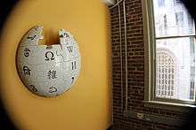
The logo of Wikipedia, an Internet-based free multilingual encyclopedia, is an unfinished globe constructed from jigsaw pieces—some pieces are missing at the top—inscribed with glyphs from many different writing systems. As displayed on the web pages of the English-language version of Wikipedia, there is a wordmark "Wikipedia" under the globe, and below that the text "The Free Encyclopedia", in the free open-source Linux Libertine font.[1][2]
Design

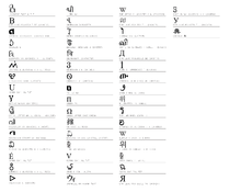
Each piece bears a glyph (a letter or other character), or glyphs, symbolizing the multilingualism of Wikipedia. As with the Latin letter “W”, these glyphs are in most cases the first glyph or glyphs of the name “Wikipedia” rendered in that language. They are as follows:[3]
- Near the center is Latin ⟨W⟩. Above that is Japanese ⟨ウィ⟩ wi; below it are Cyrillic ⟨И⟩ i, Hebrew ⟨ו⟩ w, and (barely visible at the bottom) Tamil ⟨வி⟩ vi.
- To the left of the ⟨W⟩ is Greek ⟨Ω⟩ ō, and below that are Chinese ⟨維⟩ wéi,[4] Kannada ⟨ವಿ⟩ vi, and (barely visible at the bottom) Tibetan ⟨ཝི⟩ wi.
- At left, from the top down, are Armenian ⟨Վ⟩ v, Cambodian ⟨វិ⟩ vĕ (lying on its side), Bengali ⟨উ⟩ u, Devanagari वि vi, and Georgian ⟨ვ⟩ v.
- The right-most column is Ethiopic ⟨ው⟩ wə, Arabic ⟨و⟩ w, Korean ⟨위⟩ wi, and Thai ⟨วิ⟩ wi.
The empty space at the top represents the incomplete nature of the project, the articles and languages yet to be added.
History


- See WP:Wikipedia logos for details of previous logos, including the glyphs used.
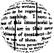
An initial design of the logo was created by Paul Stansifer, a then 17-year-old Wikipedia user, whose entry won a design competition run by the site in 2003. Another Wikipedia user, David Friedland, subsequently improved the logo by changing the styling of the jigsaw pieces so that their boundaries seemed indented and simplified their contents to be a single glyph per piece, rather than a jumble of nonsensical multilingual text.[5] In the process, some errors were introduced.[5] In particular, one piece of Devanagari script and one piece of Japanese katakana were incorrectly rendered.[6]

In 2007, a modified 3D model was developed by Wikimedia Taiwan for Wikimania, when they distributed a 3-inch diameter spherical puzzle based on the logo, that attendees could piece together. It did not add other letters on the parts that cannot be seen on the 2D logo, but used that space to include small logos of the sister projects and information about Wikimania. A variant of that model was used to build a person-sized Wikiball that spun on a stand, featured during the event.[7] This led to a renewed interest in getting a proper 3D model for the logo.

By 2007, users on listservs discovered that the logo had some minor errors. The errors were not immediately fixed, because, according to Friedland, he could not locate the original project file. Friedland added that "I have tried to reconstruct it, but it never looks right" and that the logo "should be redrawn by a professional illustrator."[5] Kizu Naoko (木津 尚子), a Wikipedian, said that most Japanese users supported correcting the errors. In an e-mail to Noam Cohen of The New York Times, Kizu said that "It could be an option to leave them as they are. Most people don't take it serious [sic] and think the graphical logo is a sort of pot-au-feu of various letters without meaning."[5]
On October 24, 2014, the Wikimedia Foundation released the logo, along with all other logos belonging to the Foundation, under the Creative Commons Attribution-ShareAlike 3.0 license.[8]
Current logo
In late 2009, the Wikimedia Foundation undertook to fix the errors and generally update the puzzle globe logo. Among other concerns, the original logo did not scale well and some letters appeared distorted.[9] For the new logo, the Wikimedia Foundation defined which characters appear on the "hidden" puzzle pieces, and had a three-dimensional computer model of the globe created to allow the generation of other views.[10] A partial 3D globe was commissioned for the Wikimedia office.[11]
The new logo was rolled out on the projects in May 2010. It features the new 3D rendering of the puzzle globe, with corrected characters (and the Klingon character replaced by a Geʿez character). The wordmark has been modified from the Hoefler Text font to the open-source Linux Libertine font, and the subtitle is no longer italicized. The "W" character, which was used in various other places in Wikipedia (such as the favicon) and was a "distinctive part of the Wikipedia brand", was stylized as crossed V's in the original logo, ⟨W⟩, while the W in Linux Libertine is rendered with a single line. To provide the traditional appearance of the Wikipedia "W", a "crossed" W was added as an OpenType variant to the Linux Libertine font.[1]

Trademark
The (former) logo was registered as a European Community Trade Mark by Wikimedia Foundation, Inc. The trade mark bears a filing date of 31 January 2008 and a registration date of 20 January 2009.[12]
Logos
 |
 |
 |
 |
|---|---|---|---|
| 2001 | 2001–2003 | 2003–2010 | 2010–present |
References
- 1 2 Poll, Philipp H. "New Wikipedia-Logo using LinuxLibertine". Libertine Open Fonts Project. Retrieved 2011-01-30.
- ↑ Oma L. Gallaga (May 23, 2010), New Globe, User Interface For Wikipedia, NPR
- ↑ "What characters are on the Wikipedia puzzle globe?".
- ↑ see 維基大典
- 1 2 3 4 Noam Cohen (June 25, 2007). "Some Errors Defy Fixes: A Typo in Wikipedia’s Logo Fractures the Sanskrit". The New York Times.
- ↑ "This Logo Is a Work in Progress." The New York Times. June 24, 2007. Retrieved on July 11, 2011.
- ↑ It was torn down after the event. See this Category of Commons images for a sense of its size.
- ↑ "Wikimedia Logos Have Been Freed! « Wikimedia blog".
- ↑ "brand new" about new logo
- ↑ Wikimedia blog – Wikipedia in 3d
- ↑ The work was done by the Because We Can studio, based on the new digital 3D model.
- ↑ "Case details for Community Trade Mark E6671838". ipo.gov.uk. UK Intellectual Property Office. January 20, 2009. Retrieved December 18, 2013.
External links
| Wikimedia Commons has media related to Wikipedia logos, |
- Wikimedia Blog: Wikipedia in 3D 3D version of the Wikipedia logo unveiled; description of the new puzzle globe logo
- Wikimedia Blog: A new look for Wikipedia
- Wikipedia:Wikipedia logos
| ||||||||||||||||||||||||||||||||||||||