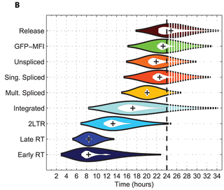
Violin plot


A violin plot is a method of plotting numeric data. It is a box plot with a rotated kernel density plot on each side.[1]
The violin plot is similar to box plots, except that they also show the probability density of the data at different values (in the simplest case this could be a histogram). Typically violin plots will include a marker for the median of the data and a box indicating the interquartile range, as in standard box plots. Overlaid on this box plot is a kernel density estimation.
Violin plots are available as extensions to a number of software packages, including the R libraries vioplot, wvioplot, caroline, UsingR, lattice and ggplot2, the Stata add-on command vioplot,[2] and the Python libraries matplotlib[3] and Seaborn.[4]
References
- ↑ "VIOLIN PLOT". NIST DataPlot. National Institute of Standards and Technology. 2015-10-13.
- ↑ Hintze, Jerry L.; Nelson, Ray D. (1998). "Violin Plots: A Box Plot-Density Trace Synergism". The American Statistician 52 (2): 181–4. doi:10.1080/00031305.1998.10480559.
- ↑ "violin plots". What's new in matplotlib.
- ↑ Waskom, Michael. "Violinplot from a wide-form dataset". Seaborn: statistical data visualization.
External links
| Wikimedia Commons has media related to Violin plots. |
- Vioplot add-in for Stata
- Example of violin plots in R
- violinplots in Python with the seaborn statistical visualization library based on matplotlib
![]() This article incorporates public domain material from the National Institute of Standards and Technology document "Dataplot reference manual: Violin plot".
This article incorporates public domain material from the National Institute of Standards and Technology document "Dataplot reference manual: Violin plot".