Folio (typeface)
 | |
| Category | sans-serif |
|---|---|
| Classification | Neo-grotesque |
| Designer(s) | Konrad Bauer and Walter Baum |
| Foundry | Bauer Type Foundry |
| Date released | 1957 |

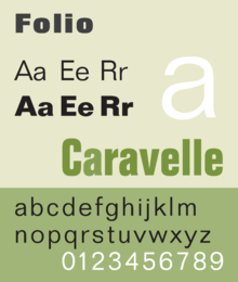
Folio is a realist sans-serif typeface designed by Konrad Bauer and Walter Baum in 1957 for the Bauer Type Foundry (German: Bauersche Gießerei).[1] Bauer licensed the design to Fonderie Typographique Française for sale in France under the name Caravelle.
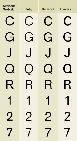
Folio is considered part of the International Typographic Style, with Helvetica and Univers also released at the same time. All three are modeled after Akzidenz-Grotesk. However, Folio more closely follows the original model than the other two, which have larger x-heights.[1] The typeface experienced moderate success in the United States. The typeface family was extended in 1963, adding an Extra Bold weight and a Bold Condensed width.
The cold type version was issued by Hell AG.
Visual characteristics
Characteristics of this typeface are:
lower case: square dot over the letter i. double storey a.
upper case: the capital Q's tail is centered under the figure, the uppercase J has a slight hook, and there are two versions of uppercase R, one with a straight leg and one with a curved leg.
figures:
Usages
Lowe's uses various weights of Folio on all in-store signage.
Little Caesars also uses various weights for some restaurant signage.
Universal Studios used Folio Bold Extended for TV-show covers from the 60's and 70's.
Tempe, Arizona uses Folio Medium under their seal in street signs.
Notes
- 1 2 Meggs, Phillip B.; Carter, Rob (1993). Typographic Specimens: The Great Typefaces. Wiley. p. 139. ISBN 0-471-28429-7.
References
- Jaspert, Berry and Johnson. Encyclopaedia of Type Faces. Cassell Paperback, London; 2001. ISBN 1-84188-139-2.
- Macmillan, Neil. An A–Z of Type Designers. Yale University Press: 2006. ISBN 0-300-11151-7.