Dot distribution map
A dot distribution map (also known as dot density map) is a map type that uses a dot symbol to show the presence of a feature or phenomenon. Dot maps rely on a visual scatter to show spatial pattern.[1]
Types of dot maps
One-to-one
In a one-to-one dot map, each dot represents one single recording of a phenomenon. Because the location of the dot corresponds to only one piece of data, care must be taken to ensure that the dot is represented in its correct spatial location. Inaccuracies in the location of the dot can misrepresent the data being mapped. Various methods exist for determining the exact spatial location of a single point, including geocoding.
One-to-many

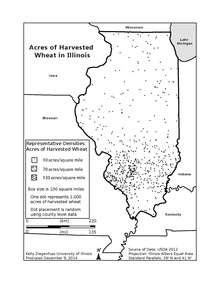
In a one-to-many, or dot-density map, each dot on the map represents more than one of the phenomena being mapped. The number of data represented by each dot is determined by the map author and may be the product of data availability. Some data, such as the addresses of cancer patients, may not be available for mapping due to restrictions on access to individuals' medical records.
In one-to-many dot distribution maps, the reader must be careful not to interpret the dots as actual locations, as the dots represent aggregate data and are often arbitrarily placed on a map. Methods of dot placement include by areal unit centroid, random dispersement, and uniform (evenly spaced) placement, among others.
Historical examples of dot distribution maps
Carte philosophique figurant la population de la France

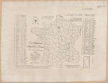
The first dot distribution map was created by a Franciscan monk, Armand Joseph Frère de Montizon (1788 - ????).[2] It is a relatively simple map of population by département (administrative district) in France and is one of the first known examples of a demographic map for the country.[3] Each dot represents 10,000 individuals. The dots are spaced in even rows, the distance between which determined by the population of the department. A table in the map lists the departments by name, population, and prefectural city. The departments were numbered on the map to correspond to the table. The regular spacing of the dots in the map produces a visual display of population density, as higher population levels within an administrative border exhibit a closer, denser pattern of dots. Since the dots are evenly spaced, it is evident that they do not represent the actual locations of where people live within a department. This is an example of an ecological fallacy, where a value for an area generalizes all within that area to exhibit that value.[4]
Although Montizon's map was the first thematic dot map published, it did not garner the author fame. Instead, his innovation had no effect on practice for nearly 30 years until the dot distribution map was "reinvented" for map by a Swedish Army officer, published in 1859.[4] This map was authored by Thure Alexander von Mentzer and shows the population distribution for the Scandinavian region. No known reproductions of this map exist.[5]
John Snow's cholera map

Display of discrete data in the form of points in a map can provide convincing evidence related to medical geography. During the mid-1850s, cholera was a major concern. When a large outbreak occurred in London in 1854, Dr. John Snow created a dot distribution map that settled a debate between two schools of thought: that cholera is transmitted not through the inhalation of infected air, but through the ingestion of contaminated water or food.[6]
Snow's map of the 1854 Broad Street cholera outbreak in London was simple and effective in its design. The base map is a simple road network, with few buildings named or depicted. Study area is outlined along the relevant road centerlines. Water pumps around the neighborhood are symbolized with points and bold, uppercase labels. Cholera deaths are depicted along the road network in their correct locations by address, with quantities measured by parallel tick marks stacked next to the road.[7] The symbology, while simple, is effective for a study of fatal disease. The symbology of the cholera deaths is reminiscent of large Plague events, where bodies are stacked next to the roadway for disposal. However, SNow's work is derivative of Thomas Shapter's work in Exeter, Devon.
The map showed that a high number of deaths were occurring near a water pump on Broad Street at Cambridge Street. Snow petitioned the local authorities to remove the pump's handle, which caused dramatic decreases in cholera cases for the immediate area.[6] The map helped the germ theory of disease transmission supplant miasma theory as the widely accepted view.
Advantages and disadvantages of dot distribution maps
Dot maps are advantageous when mapping phenomena that change smoothly over a space, as the dot maps will visually match the phenomena.[8]
Dot distribution maps also have disadvantages. One such disadvantage is that the actual dot placement may be random. That is, there may be no actual phenomenon where the dots are located. Second, the subjective nature of the dot size and spacing could give the map a biased view. Inappropriately sized or spaced dots can skew or distort the message a map attempts to communicate. If the dots are too numerous, it may be difficult for the reader to count the dots. This can cause the map to be ineffective in communicating its message.
Solutions to problems in dot maps can be found through the combination of remotely sensed data. Satellite imagery showing lights at night can give good indication of population density. With such information, clustering of dots to relevant areas could possibly be applied to analyses. Data from the Oak Ridge National Laboratory's Landscan project is commonly used in this emerging technique.
Dot maps today
A large portion of the new maps appearing today are generated not through government agencies or geographical societies and associations, but by common individuals from all walks of life. Users of such virtual globe services as Google Earth constantly create new thematic maps quickly and easily. Such services offer a base platform upon which users can display layers as they choose, or even add their own data to the display.
One example was created on April 21, 2009 by Pittsburgh biochemist Harry Niman.[9] The map shows where the 2009 H1N1 swine flu virus was spreading at the time. Despite the fact that the data shown was not backed by any official agency, the author's creation had "gone viral", surpassing 290,000 web views and 3,000 comments within nine days of its being published online.[10]
Emerging technology is increasingly making mapping more mobile. Dot distribution maps, through their simple and effective displays, are becoming the standard for such on-the-fly mapping services.
Starting in March 2004, Seth Anthony created a project, called the Dot Project, to create red dot maps for Rambot-created Wikipedia articles.
References
- ↑ Pearson Education, Inc. "Key Terms." Making Maps With GIS. Pearson Education, Inc. 8 December 2009. http://wps.prenhall.com/esm_clarke_gsgis_4/7/1848/473320.cw/index.html. 1 May 2010.
- ↑ Frère de Montizon, Armand Joseph (1830). Carte philosophique figurant la population de la France.
- ↑ Gilles Palsky (1984). "La naissance de la démocartographie. Analyse historique et sémiologique". Espace, populations, sociétés (Université des Sciences et Technologies de Lille) 2 (2): 25–34. doi:10.3406/espos.1984.956. ISSN 0755-7809.
- 1 2 Konvitz, Josef W. Cartography in France, 1660-1848: Science, Engineering, and Statecraft. University of Chicago Press, 1987. p. 147.
- ↑ Johnson, Zachary Forest. "Dot Density." The First Thematic Maps. N.p., 3 November 2009. http://indiemaps.com/blog/. 1 May 2010.
- 1 2 Rosenberg, Matt. "Map Stops Cholera: John Snow's Map of London." About.com:Geography. N.p., 1 May 2010. http://geography.about.com/cs/medicalgeography/a/cholera.htm. 1 May 2010.
- ↑ Andreit. "Ghost Map (1854 Cholera Outbreak)." Umapper. 13 October 2009. http://www.umapper.com/maps/view/id/43438/. 1 May 2010.
- ↑ Crampton, Jeremy M. "Dot and Dasymetric Map Types." 31 March 2008. http://monarch.gsu.edu/jcrampton/courses/geog4518/notes/week_11bdot_dasy.html. 1 May 2010.
- ↑ http://flutracker.rhizalabs.com 17 May 2012.
- ↑ "Online Swine Flu Map Goes Viral." CNN.com/technology. CNN, 30 April 2009. http://edition.cnn.com/2009/TECH/04/30/online.flumaps/index.html. 1 May 2010.