Clifton Firth
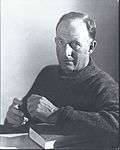
Reginald Clifton Firth (1904–1980) was a New Zealand graphic designer and photographer. Influenced by writings of the Bauhaus and contemporaries, especially the Swiss typographer Jan Tschichold, Firth’s design work of the late 1920s and early 30s was some of the earliest modernist graphic design in New Zealand. Firth later went on to be a successful portrait photographer in Auckland during and after the Second World War.
Biographical background
Born in 1904, Firth was the grandson of Josiah Firth, one of Auckland’s founding fathers. he was educated at King’s College(1911-1919), followed by a year in Christchurch at Christ’s College. At King’s, Firth became friends with classmate Merton Hodge, and in 1920 they both enrolled in a small Auckland Art school. A few days after they enrolled, the institution was shut down following a police raid and the subsequent arrest of the faculty on drugs charges. Firth also briefly attended night classes at the Elam School of Art, however this was the extent of his formal design training.
Graphic design
Firth became advertising designer for the family company, Firth Concrete, in 1927, where he immediately designed the Firth ‘Ironclad’ Logo, which would remain part of the company’s image for over forty years. During this period Firth was increasingly influenced by new trends of modernism coming out of Europe, specifically from the Bauhaus. Contemporary Bill Haythornthwaite recalls – “we used to pick up the original Bauhaus material coming out of Germany from the [Elam Art School] library before Hitler wrecked it (sic)”.[1] Firths lack of formal graphic design training seems to have served him well, given that at this time, design training was essential an art historical exercise in the European masters; “a year [of] drawing Italian sculptures and that sort of thing”.[2] This lack of adherence to tradition allowed Firth to explore new avenues in design.
Significant is Firths use of Typography. Likely influenced by Jan Tschichold's Typographische Gestaltung[3] or the earlier Die Neue Typographie.[4]
Firth designed advertisements for Firth Concrete, and later the New Zealand architecture magazine Home & Building which were highly innovative in their use of typography, compared to the bulk of graphic design being produced in New Zealand at that time. Firths designs used features such as sans serif faces and asymmetrical compositions. All ornamentation and superfluous elements stripped out, Firth used the varying weight and density of the type in his compositions in order to draw attention and add emphasis. This may seem common today, but in the context of the day, where the standard approach towards typography in advertisement was to get the most ‘bang for the buck’; stripping out elements and adding emphasis through type variation was a highly novel and ‘modern’ concept.
Photography
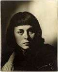
Unlike Firth's typographical work, influenced by European Modernism, Firth's Photography was evocative of Hollywood glamour shots of the era. Firth set up his photographic studio with his wife Patricia in 1938. The war years proved to be a lucrative period for Firth's photography, taking photos for those heading off to war, both of the soldiers for those they left behind, and of the soldiers sweethearts to take with them to war.
On his retirement in 1974, Firth gave much of his surviving work to Auckland Libraries, including many display prints as well as more than 100,000 photographic negatives.[5]
Gallery
- Photographs by Clifton Firth
-

Portrait of A.R.D. Fairburn, taken 26 March 1953.
-

Full length portrait of a Milne and Choyce model, taken in the 1940s.
-

Showing a montage of parts of the human face and body - unused book jacket for Ngaio Marsh.
-

Quarter length portrait of Anne McKeever in shadows, taken 1949.
-

Showing an Aquires caravan in an area of native bush, taken c1940s.
-

Showing six men working around a table with neon signs in the background, for Rayneon, taken 1941.
Notes
- ↑ Interview with Kate Eagleson, 19 September 1995
- ↑ Interview with Kate Eagleson, 19 September 1995
- ↑ Jan Tschichold, Asymmetric Typography. London, Faber 1967
- ↑ Jan Tschichold, Die neue Typographie, Berkely, University of California Press, 1995
- ↑ Sharp, Iain (2007). Real gold : treasures of Auckland City Libraries. Auckland University Press.
References
- Eagleson, Kate; “Clifton Firth : the typographic work” Modern New Zealand, 6, (Aug 1996): 2-11
- Interview with Kate Eagleson, 19 Sep. 1995.
- Lloyd Jenkins, Douglas; 40 legends of New Zealand design. Auckland, N.Z. : Godwit, 2006. 56 – 58.
- Tschichold, Jan; Asymmetric Typography. London, Faber 1967
- Tschichold, Jan; Die neue Typographie (trans. The New Typography: a handbook for modern designers), Berkely, University of California Press, 1995
External links
- Auckland Libraries: Clifton Firth.
- Heritage et AL: Clifton Firth
- Firth, Clifton; Real Gold, Treasures of Auckland City Libraries - Arts
- Firth, Clifton; The Necessity of Modernisim
- Gillam, Jennifer. "Firth, Reginald Clifton 1904 – 1980". Dictionary of New Zealand Biography. Ministry for Culture and Heritage.
- Work by Clifton Firth in the collection of the Museum of New Zealand Te Papa Tongarewa