Bruce Rogers (typographer)
| Bruce Rogers | |
|---|---|
 Photo of Bruce Rogers | |
| Born |
Albert Bruce Rogers May 14, 1870 Linnwood, Indiana |
| Died |
May 21, 1957 (aged 87) New Fairfield, Connecticut |
| Nationality | American |
| Known for | Typographer |
| Notable work | Centaur (typeface), bookplates |
| Spouse(s) | Anna Embree Baker |
Bruce Rogers (May 14, 1870–May 21, 1957) was an American typographer and type designer, acclaimed by some as among the greatest book designers of the twentieth century.[1] Rogers was known for his "classical" style of design, rejecting modernism, never using asymmetrical arrangements, rarely using sans serif type faces, favoring stolid roman faces such as Caslon and his own Centaur. His books now fetch high sums at auction.
Early life
Born Albert Bruce Rogers in Linnwood, Indiana, he never used the name Albert and was known to associates as "BR." Rogers received a B.S. from Purdue University in 1890. At Purdue, he worked with political cartoonist John T. McCutcheon on the student newspaper and yearbook.
After graduation Rogers worked as both an artist for the Indianapolis News and as office boy for a railroad. After seeing several Kelmscott Press editions, Rogers became interested in producing fine books, and so moved to Boston, then a center of publishing, where he free-lanced for L. Prang and Co..[2]
Typographer and type designer

Riverside Press period (1895–1911)
In 1895 he took a position designing books for Riverside Press in Cambridge, Massachusetts where he worked on trade books and designed book advertisements for the Atlantic Monthly. In 1900 a Department of Special Bookmaking for the production of fine editions was created with Mr. Rogers its head. More than sixty of these Riverside Press Editions were designed by Rogers, decorated with illustrations and ornament largely by him, and printed on handmade, damped paper.[3] It was there, in 1901, that he cut his first typeface, Montaigne, a Venetian style face named for the first book it appeared in, a 1903 limited edition of The Essays of Montaigne.[4]
New York/Dyke Mill period (1911–1916)
In 1912 Rogers moved to New York City, where he worked both as an independent designer and as house designer for the Metropolitan Museum of Art. It was for the Museum's 1915 limited edition of Maurice de Guérin's The Centaur that he designed his most famous type-face, Centaur. Like Montaigne it was based on the Venetian faces of Nicolas Jenson. Rogers considered this face to be an improvement on his earlier Montaigne, both because his design had matured and because, on the advice of Frederic Goudy, he had employed Robert Wiebking as the punch-cutter; and Rogers used Centaur extensively for the rest of his career[5] The Centaur was produced by Rogers in Dyke Mill at Carl Purington Rollins' Montague Press (hand-set by his wife, Anne Rogers (1867–1931)), and it is now one of the most collected books ever printed.[6]
First visit to Britain
In 1916 Rogers left for England to work with Emery Walker, hoping to establish a press for fine editions. However, because of wartime conditions, only one book was produced, and Rogers soon sought employment with the Cambridge University Press. He found conditions at the press to be poor, and his report to the syndics of the press resulted in many reforms and paved the way for the hiring of Stanley Morison as typographic adviser.[7]
Mount Vernon period (1919–1928)
After returning to the U.S., Rogers met William Edwin Rudge, who began to use Rogers extensively as a book designer for his Mount Vernon Press. This was Rogers' most productive and remunerative period, as he worked three days a week designing books for Rudge, served as typographic adviser and designed books for Harvard University Press (from 1920–1936), served as typographic adviser to Lanston Monotype, and produced a few books for the June House Press, which he operated in partnership with James Raye Wells and James Hendrickson.[8]
Second visit to Britain
In 1928 Rogers left for England in hopes of producing an edition of Homer's Odyssey translated by T.E. Lawrence. Despite Rogers's being very "bookish," he soon became close, lifelong friends with the dashing Lawrence of Arabia. The project took four years and the fine book was printed in Centaur types, on gray handmade paper, bound in black Niger leather. Rogers also became engaged to produce the renowned Oxford Lectern Bible for Oxford University Press. This project took six years, requiring annual trips to Oxford to oversee its completion in 1935. Joseph Blumenthal called this "The most important and notable typographic achievement of the twentieth century."[9] To produce the Bible, an italic complement to Centaur was needed. As he did not feel capable of designing the sort of chancery face that he thought appropriate, Rogers chose to pair Centaur with Frederic Warde's Arrighi, a pairing retained to this day.[10]
October House period (1932–1957)
In later years Rogers worked as a free-lancer, designed his World Bible, and wrote and designed his book on printing, Paragraphs on Printing, published by William E. Rudge's Sons in 1943.[11]
Personal life
In 1900 Rogers married Anna Embree Baker, and they remained together until her death in 1936. As Rogers spent most of his working life as a free-lancer, they lived frugally and were often in financial straits. Rogers purchased October House, his residence in New Fairfield, Connecticut, in 1925, and made this his permanent home from 1932 until his death. Rogers was a member of the Typophiles, and smoked imported English cigarettes.[12]
Death
Rogers died on May 18, 1957 in New Fairfield, Connecticut.
In later life Rogers and his wife Anne donated a substantial collection of books, early manuscripts, and antique furniture to Purdue University's Special Collection Library. The bulk of his papers are in the collection of the Beinecke Rare Book and Manuscript Library.[13]
Works
Sayings of Bruce Rogers
- "Don't borrow contemporary work — you are sure to be found out."
- "Never apologize."
- "The first requisite of all book design is orderliness."
- When told that something he had produced was not "according to Hoyle" he answered, "We're Hoyle.".[14]
Typefaces
- Montaigne (1901, privately cast), punches cut by John Cumming
- Centaur (original) (1914, privately cast by Barnhart Brothers & Spindler), matrices cut by Robert Wiebking of the Western Type Foundry.
- Centaur (Monotype) (1929, Monotype Ltd. and Mackenzie & Harris), matrices re-cut for machine composition by British Monotype.[15]
Bookplates
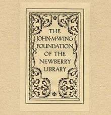
In addition to his work as a typographer and type designer, Rogers worked designing ephemera, such as bookplates. Bookplates by Rogers that have survived in library and museum collections show that his bookplate designs were text-based, only rarely including small images, and frequently showcased his type designs.
- Bookplates designed by Bruce Rogers
-

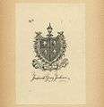
An early (1900) Bruce Rogers bookplate, lacking his usual block text.
-

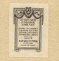
Type-based bookplate for the Harvard College Library
-

A second bookplate for the Harvard College Library, featuring a different typeface
-

A third bookplate for the Harvard College Library, featuring a third typeface
-

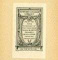
An elaborate Rogers bookplate for the Typographic Library and Museum of the American Type Founders Company
Additional reading
- Kelly, Jerry. The First Flowering: Bruce Rogers at the Riverside Press, 1896-1912 (2008. David Godine, Boston, USA) [with check-list]
- Rogers, Bruce. Pi; a hodge-podge of the letters, papers, and addresses written during the last sixty years (1972. Freeport, NY: Books for Libraries Press)
- Rogers, Bruce, Paragraphs on Printing (1943. William E. Rudge's Sons, NY. Reprint 1980. Dover Publications, NY)
- Targ, William. The making of the Bruce Rogers World Bible (1949. Cleveland: World Publishing Co.)
- Warde, Frederic. Bruce Rogers, designer of books And Bruce Rogers: a bibliography; hitherto unrecorded work 1889-1925, complete works 1925-1936, by Irvin Haas. (1936. Mount Vernon: The Peter Pauper Press; 1967 Port Washington, NY: Kennikat Press)
- The work of Bruce Rogers, jack of all trades, master of one: a catalogue of an exhibition arranged by the American Institute of Graphic Arts and the Grolier Club of New York. With an introduction by D. B. Updike, a letter from John T. McCutcheon, and an address by Mr. Rogers. Publisher: Oxford University Press, New York 1939
References
- ↑ This view is advanced by Daniel Berkeley Updike, William Addison Dwiggins, Thomas Maitland Cleland, Will Bradley, Frederic Goudy, Frederic Warde, Rudolph Ruzicka, and Stanley Morison. Hendrickson, James, Bruce Rogers, in Heritage of the Graphic Arts edited by Chandler B. Grannis, R.R. Bowker Company, New York & London, 1972, p. 61.
- ↑ Hendrickson, Bruce Rogers, pp. 61-63.
- ↑ Hendrickson, Bruce Rogers, p. 63.
- ↑ Hlasta, Stanley C., Printing Types & How to Use Them, Carnegie Press, Pittsburgh, PA, 1950, pp. 19-24.
- ↑ Hlasta, Printing Types & How to Use Them, pp. 19-24.
- ↑ Hendrickson, Bruce Rogers, p. 64.
- ↑ Hendrickson, Bruce Rogers, pp. 65-66.
- ↑ Hendrickson, Bruce Rogers, pp. 65-66.
- ↑ Hendrickson, Bruce Rogers, pp. 72.
- ↑ Hlasta, Printing Types & How to Use Them, pp. 19-24.
- ↑ Hendrickson, Bruce Rogers, pp. 73-74.
- ↑ Hendrickson, Bruce Rogers, pp. 67 & 77.
- ↑ Hlasta, Printing Types & How to Use Them, pp. 19-24.
- ↑ Hendrickson, Bruce Rogers, pp. 68, 66, 77, & 68.
- ↑ Lawson, Alexander, Anatomy of a Typeface, David R. Godine, Publisher, Boston, 1990, ISBN 0-87923-332-X, pp. 62-73.
External links
| Wikimedia Commons has media related to Bruce Rogers (typographer). |
- Works by or about Bruce Rogers at Internet Archive
- An exhibit of Rogers' work at the Minnesota Center for Book Arts
- An article on Centaur, a font designed by Rogers, in Harvard Magazine
- Works by or about Bruce Rogers in libraries (WorldCat catalog)
- Linotype Font Designer Gallery entry for Bruce Rogers
- Emery Walker Trust
- The Bruce Rogers Collection From the Rare Book and Special Collections Division at the Library of Congress
- Bookplates by Bruce Rogers in the University of Delaware Library's William Augustus Brewer Bookplate Collection
|