Akzidenz-Grotesk
 | |
| Category | Sans-serif |
|---|---|
| Classification | Grotesque sans-serif |
| Foundry | H. Berthold AG |
| Date released | 1896 |
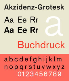
Akzidenz-Grotesk is a grotesque (early sans-serif) typeface originally released by the Berthold Type Foundry in 1896 under the name Accidenz-Grotesk.[1] One of the first sans serif typefaces to be widely used, its design influenced many later designs, especially many neo-grotesque typefaces released after 1950. Akzidenz means a 'trade' type for commercial use.[lower-alpha 1] It was sometimes sold as Standard or Basic Commercial in the USA.[5]
History


The design of Akzidenz-Grotesk has been theorized to be derived from Walbaum or Didot, as demonstrated by the similar font metrics when the serifs are removed.[6] However, Akzidenz-Grotesk's hot metal type family included fonts made a range of foundries to slightly different designs, such as the c. 1880 typeface Royal Grotesk Light from the Berlin foundry Ferdinand Theinhardt Schriftgiesserei,[7] designed by Ferdinand Theinhardt for the scientific publications of the Royal Prussian Academy of Sciences in Berlin. FTS also supplied the regular, medium and bold weights of the typeface. While Hermann Berthold took over Theinhardt's Berlin foundry in 1908, it wasn't until the fall of the Prussian monarchy in 1918 that Royal Grotesk was published as part of the Akzidenz-Grotesk font family and renamed Akzidenz-Grotesk Condensed.[8]
Contemporary versions of Akzidenz-Grotesk descend from a late-1950s project, directed by Jimmy Lazar at Berthold, to enlarge the typeface family, adding a larger character set, but retaining all of the idiosyncrasies of the 1898 face. Under the direction of Günter Gerhard Lange, he had designed 33 font styles to the Akzidenz-Grotesk family, including AG Extra (1958), AG Extra Bold (1966) and AG Super (1968), AG Super Italic (2001) and Extra Bold italic (2001).[9]
Berthold released Akzidenz-Grotesk in OpenType format in 2006, under the name Akzidenz-Grotesk Pro, and added matching Cyrillic and Greek characters the next year.[10][11]
Akzidenz-Grotesk and Georgia are the official fonts of the American Red Cross. Akzidenz-Grotesk is used on the national logo and national guidelines require the font to be used on all chapter logos. All American Red Cross publications must be printed in Akzidenz-Grotesk or Georgia fonts.[12]
Akzidenz-Grotesk is also the font used in Arizona State University brand logo;[13] in extra bold italic form, used in the NASCAR Sprint Cup Series for the driver's surname placed on the windshield of the race cars; and in light condensed form, used in the Brooklyn Nets' logo. In the late 1990s and early 2000s, Akzidenz-Grotesk was used heavily on The Weather Channel's on-screen graphics.
Distinctive characteristics
Characteristics of this typeface are:
lower case: A rather 'folded-up' appearance with narrow apertures and strokes curled up towards the vertical, most obvious on letters such as c, e, s and a. Stroke endings are not exactly horizontal or vertical, unlike Helvetica. A square dot over the letter i. Double story a.
upper case: G with a vertical spur. A dropped horizontal stroke on A.
Its use of an oblique style rather than a true italic was extremely influential.
Variations
Several other type designers modelled typefaces from this popular typeface. Max Miedinger at the Haas Foundry used it as a model for the typeface Neue Haas Grotesk, released in 1957 and renamed Helvetica in 1960. Miedinger sought to refine the typeface making it more even and unified. Two other releases from 1957, Adrian Frutiger's Univers and Bauer and Baum's Folio, take inspiration from Akzidenz-Grotesk.
Akzidenz-Grotesk Book


Akzidenz-Grotesk Book is a variant designed by Günter Gerhard Lange between 1969 and 1973. It incorporates some features found in Helvetica, such as strike-through tail in Q, horizontal and vertical cut stroke terminators. As in some Helvetica versions, the cedilla is replaced with a comma.[14]
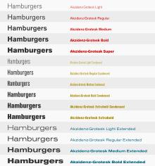
In 2006, the font family was updated with OpenType feature, and was expanded to 3 widths with 5 (later 6) weights (4 weights in condensed and extended fonts) each, and includes complementary italic fonts. In 2007, OpenType Pro versions of the fonts were released. In 2008, medium outline, bold outline, and medium stencil fonts were released.
AG Book Pro+ (2008)
This version supports Cyrillic and Greek characters.
Akzidenz-Grotesk Book Rounded
Akzidenz-Grotesk Book Rounded is a variant designed by Günter Gerhard Lange in 1980. It features rounded stroke terminators on AG Book design (hax). In 2007, OpenType Pro versions of the fonts were released.
AG Book Rounded Pro+ (2008)
This version supports Cyrillic and Greek characters.
Akzidenz-Grotesk Schoolbook
Akzidenz-Grotesk Schoolbook is a variant designed by Günter Gerhard Lange in 1983. Based on Akzidenz-Grotesk Book, it uses single-storey a, curled l, k and K with alternate intersecting branching, hookless t, legless u, hookless y, hooked I, J with top bar, M with middle not touching baseline, R with tail forked from stem. Each font weight has 2 fonts featuring alternative designs. In 2008, OpenType Pro versions of the fonts were released.
Akzidenz-Grotesk Old Face
Akzidenz-Grotesk Old Face is a variant designed by Günter Gerhard Lange in 1984. It is based on the original Akzidenz-Grotesk. Euro sign was changed to diagonal cut. It also incorporates quirks, such as comma-styled cedilla on medium and bold weights, inward hook in regular-weighted ß, shortened horizontal serif in regular-weighted 1, which are absent in the original font family.
Regular, medium, bold, outline, bold outline, shaded fonts have been made for the family, but no italic fonts. In 2008, a shaded font was released.
Akzidenz-Grotesk Next
In December 2006, Berthold announced the release of Akzidenz-Grotesk Next.[15] Designed by Bernd Möllenstädt and Dieter Hofrichter, this typeface family features readjusted x-heights and weights throughout the family, giving a more consistent type design. The family consists of 14 variants with 7 weights in roman and italic, in a single width.
Similarities to other typefaces

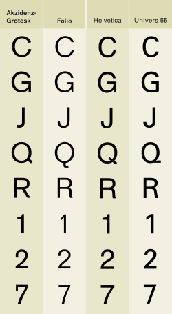
Akzidenz-Grotesk is sometimes at first glance mistaken for the Helvetica or Univers typefaces. The similarities of Helvetica and Akzidenz-Grotesk are apparent, but the subtle differences include the uppercase and lowercase C and the uppercase G, J, R and Q. Aside from the subtle differences in these individual letters, Miedinger's primary change to Akzidenz-Grotesk is Helvetica's higher x-height, the distance from the baseline to the height of the lowercase letter x. The general effect is that Helvetica appears more oblong while Akzidenz-Grotesk maintains circular counters and bowls. Both Helvetica and Univers are more regular and have a greater consistency of stroke weight.
Some new weights, condensed and extended widths were released under the title Standard.
Linotype sells a version of Akzidenz-Grotesk under the name Basic Commercial. This is based on Linotype's digitization of the typeface, which is also sold under the Akzidenz-Grotesk name by various foundries; Linotype uses a different name to avoid trademark infringement.[16] However, as of 2008, Linotype's online store also sells Akzidenz-Grotesk and other Berthold variants under the original names.
See also
Notes
- ↑ Akzidenz-Grotesk Goes Greek and Cyrillic
- ↑ "Identifont post". Identifont. Retrieved 20 June 2015.
- ↑ Majoor, Martin. "Inclined to be dull". Eye magazine. Retrieved 20 June 2015.
- ↑ Spiekermann, Erik. "Comments on Typophile thread". Typophile. Retrieved 20 June 2015.
- ↑ Shaw, Paul. "Helvetica & Standard". Blue Pencil. Retrieved 1 July 2015.
- ↑ My Type Design Philosophy by Martin Majoor
- ↑ Akzidenz Grotesk roots
- ↑ page 21, Sans Serif: The ultimate sourcebook of classic and contemporary sans serif typography, Thames & Hudson, Cees W. de Jong, 2006
- ↑ page 23, Sans Serif: The ultimate sourcebook of classic and contemporary sans serif typography, Thames & Hudson, Cees W. de Jong, 2006
- ↑ Berthold Announces the Release of Akzidenz-Grotesk in OpenType Format
- ↑ AG goes Greek and Cyrillic
- ↑ American Red Cross Brand Standards
- ↑ Arizona State University Communication Guide | Font Standard
- ↑ Schwartz, Christian. "Neue Haas Grotesk". Retrieved 28 November 2014.
- ↑ Berthold Releases Akzidenz-Grotesk Next
- ↑ Thread on Typophile containing Linotype's official explanation of the origin of Basic Commercial, in response to an accusation of forgery.
References
- Bringhurst, Robert. The Elements of Typographic Style. Hartley & Marks: 1992. ISBN 0-88179-033-8.
- Fellici, James. The Complete Manual of Typography. Adobe Press: 2002. ISBN 978-0-321-12730-3.
- Fiedl, Frederich, Nicholas Ott and Bernard Stein. Typography: An Encyclopedic Survey of Type Design and Techniques Through History. Black Dog & Leventhal: 1998. ISBN 1-57912-023-7.
- Kane, John. A type primer. Prentice Hall: 2002. ISBN 0-13-099071-X.
- Macmillan, Neil. An A–Z of Type Designers. Yale University Press: 2006. ISBN 0-300-11151-7.
- "Berthold Fonts".
External links
| Wikimedia Commons has media related to Akzidenz Grotesk. |
- Berthold pages: AG Book Pro+, AG Book Rounded, AG Book Stencil et al, AG Old Face, AG Schoolbook, Akzidenz-Grotesk Pro+, Akzidenz-Grotesk Next
- Akzidenz-Grotesk Next
- Akzidenz Grotesk sample books
- Typowiki: Akzidenz-Grotesk
- Some notes on the history of Akzidenz-Grotesk, Indra Kupferschmid
- Akzidenz-Grotesk on Fonts.com