10-foot user interface


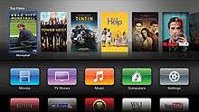
In computing, a 10-foot user interface (also sometimes referred to as "10 foot UI", "10 foot interface", "10 foot experience", or "10 foot design") is a graphical user interface for large televisions, with ergonomical display elements (menus, buttons, text fonts, etc.) easily read from a distance of 10 feet (3 meters), and controlled using a regular television style remote control.[1][2][3][4] The minimum core buttons are designed for simplicity and clarity.[5][6]
Overview
10 foot interfaces are used by devices or software applications dedicated to its user interface being displayed on a television. Television here is defined to be a typical living room television experience, meaning displayed on a big screen, where the user is sitting far away from it, and the dominant form of input will be something like a D-pad on a remote control, (with only up, down, left, and right buttons), not through touch or mouse.[7]
Design
"Ten foot" is used to differentiate the GUI style from those used on desktop computer screens, which typically assume the user's eyes are less than two feet (60 cm) from the display. The 10 foot GUI is almost always designed to be operated by a simple hand-held remote control. The 10-foot user-interface has extra large buttons with menu fonts that are easily read and navigated.[8][9]
This difference in distance from the screen has a huge impact on the interface design compared to typical desktop computer interaction when the user is sitting at a desk with a computer monitor, and using a mouse and keyboard (or perhaps a joystick device for video games) which is sometimes referred to as a "2-foot user interface". Ten-foot interfaces may resemble other post-WIMP systems graphically, due to a similar paucity of pixels, but do not assume the use of a touch screen.[10][11]
The goal of 10 foot user interface design is normally to make the user's interaction as simple and efficient as possible, trying to achieve a more laid-back and relaxed user experience with as few button presses as possible while still having an intuitive layout, in terms of accomplishing user goals—what is often called user-centered design. Good user interface design facilitates finishing the task at hand without drawing unnecessary attention to itself. Graphic design may be utilized to support its usability, however the design process must balance technical functionality and visual elements (e.g., mental model) to create a system that is not only operational but also usable and adaptable to changing user needs.[12][13][14]
See also
- Smart TV
- List of smart TV platforms and middleware software
- Interactive television
- Industrial design
- Experience design
- User interface
- User experience design
- User-centered design
- User interface engineering
- Interaction design
- Human-Machine Interface
- Emotional Design
- Experience design
- Graphical user interface
- Human-computer interaction
- Human interface guidelines
- Icon design
- Interaction design
- Interaction design pattern
- Interaction technique
- Interaction Flow Modeling Language (IFML)
- Natural mapping (interface design)
- Participatory design
- Principles of user interface design
References
- ↑ Eight Reasons To Get a Google TV and Four Reasons Not To
- ↑ YouTube's 10 Foot User Interface: The Elephant in the Room Just Got Bigger
- ↑ The Digital Home: Designing for the Ten-Foot User Interface
- ↑ http://download.intel.com/support/motherboards/desktop/sb/nuci3hometheatersolutionguide_v02.pdf Intel Next Unit of Computing Driving your 10 foot experience
- ↑ 10 foot Style / Graphical User Interface (GUI) for Growl
- ↑ Designing For TV
- ↑ Android API Level 16 Public Abstract Class String: FEATURE_TELEVISION
- ↑ PC Magazine Definition of: 10-foot user interface
- ↑ https://developer.nvidia.com/android-tv-developer-guide Android TV Developer Guide (Nvidia)
- ↑ AVerMedia TV Software
- ↑ Building a 10 Foot UI: Dealing With Platform Diversity
- ↑ http://developer.android.com/design/tv/index.html Designing for Android TV
- ↑ http://www.quora.com/Why-is-the-10-foot-home-TV-experience-so-hard-to-get-right Why is the "10 foot" home TV experience so hard to get right?
- ↑ https://developer.android.com/training/tv/index.html Building Apps for TV
| ||||||||||||||||||||||||||||||
| ||||||||||||||||||||||||||||||