Schwabacher

The German word Schwabacher (pronounced [ˈʃvaːˌbaxɐ]) refers to a specific blackletter typeface. The term derives from the town of Schwabach.
Characteristics
The lower case g and the upper case H have particularly distinctive forms.
History
The Schwabacher was a blackletter typeface that evolved from textualis under the influence of Humanist type design in Italy. It was nearer to handwriting than the textualis style. In the 16th century, it was displaced by fraktur as the most-used German typeface from about 1530. Thereafter it was in use as a secondary typeface in a similar way to italic.[1] It was still used occasionally until the mid 20th century.
Fraktur was abandoned, although widely used before, by the Nazis with the Normalschrifterlass of 3 January 1941, where it is called Schwabacher Judenlettern "Jew-letters of Schwabach":[2]

On behalf of the Führer I notifyfor common attention that:
Regarding and calling the so called gothic typeface as a German typeface is wrong. In fact, the gothic typeface consists of Jew-letters from Schwabach. Like they later gained control of the newspapers, the Jews living in Germany had seized control over the printing shops at introduction of the printing press, so that the Schwabacher Jew-letters were heavily introduced in Germany.
Today the Führer decided in a meeting with Reichsleiter Max Amann and book printing shop owner Adolf Müller, that the Antiqua typeface is to be called the normal typeface in future. Step by step all printing products have to be changed to this normal typeface. As soon as this is possible for school books, in schools only the normal typeface will be taught.
Authorities will refrain from using the Schwabacher Jew-letters in future; certificates of appointment, road signs and similar will only be produced in normal typeface in future. On behalf of the Führer, Mr. Amann will first change those papers and magazines to normal typeface, that are already spread abroad or are wanted to be.
Signed Martin Bormann
There is no evidence of any actual connection between Jews and the Schwabacher typeface.
Samples

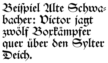
The German sentence in the figures reads: "Beispiel Alte Schwabacher [Example of old Schwabacher]: Victor jagt zwölf Boxkämpfer quer über den Sylter Deich". This is a nonsense sentence meaning "Victor chases twelve boxers across the great dam of Sylt", but contains all 26 letters of the alphabet plus the German umlauts and is thus an example of a pangram.
Notes and references
- ↑ Steinberg, S. H. (1961) Five Hundred Years of Printing; 2nd ed. Penguin Books; p. 41
- ↑ Burke, Christopher (1998), Paul Renner: the Art of Typography, New York: Princeton Architectural Press, pp. 165–167, ISBN 978-1-56898-158-1
Further reading
- Friedrich Beck: „Schwabacher Judenlettern“ - Schriftverruf im Dritten Reich. in: Die Kunst des Vernetzens, Verlag für Berlin-Brandenburg, 2006, ISBN 3-86650-344-X (pdf)
- Philipp Luidl: Die Schwabacher – Die ungewöhnlichen Wege der Schwabacher Judenletter. Maro Verlag, Augsburg 2004. ISBN 3-87512-415-4
- "Vergessen und verdrängt" Schwabach 1918-1945, Ausstellungskatalog Stadtmuseum Schwabach, p. 172
External links
| Wikimedia Commons has media related to Schwabacher. |
- "Die Alte Schwabacher Schrift" (in German). Schwabach SPD. Archived from the original on March 18, 2009.
| ||||||||||||||||||||||||||||||||||||||||||||||||||||||||||||||||||