Pareto chart
| Pareto chart | |
|---|---|
 | |
| One of the Seven Basic Tools of Quality | |
| First described by | Joseph M. Juran |
| Purpose | To assess the most frequently occurring defects by category† |
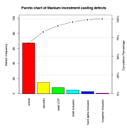
A Pareto chart, named after Vilfredo Pareto, is a type of chart that contains both bars and a line graph, where individual values are represented in descending order by bars, and the cumulative total is represented by the line.
The left vertical axis is the frequency of occurrence, but it can alternatively represent cost or another important unit of measure. The right vertical axis is the cumulative percentage of the total number of occurrences, total cost, or total of the particular unit of measure. Because the reasons are in decreasing order, the cumulative function is a concave function. To take the example below, in order to lower the amount of late arrivals by 78%, it is sufficient to solve the first three issues.
The purpose of the Pareto chart is to highlight the most important among a (typically large) set of factors. In quality control, it often represents the most common sources of defects, the highest occurring type of defect, or the most frequent reasons for customer complaints, and so on. Wilkinson (2006) devised an algorithm for producing statistically based acceptance limits (similar to confidence intervals) for each bar in the Pareto chart.
These charts can be generated by simple spreadsheet programs, such as Apache OpenOffice/LibreOffice Calc [1] and Microsoft Excel [2] and specialized statistical software tools as well as online quality charts generators.
The Pareto chart is one of the seven basic tools of quality control.[3]
See also
- Control chart
- Histogram
- Pareto analysis
- Quality control
- Seven Basic Tools of Quality
- Statistical process control (SPC)
References
- ↑ Chart Type Column and Line
- ↑ Pareto Chart in Excel Best Excel Tutorial
- ↑ Nancy R. Tague (2004). "Seven Basic Quality Tools". The Quality Toolbox. Milwaukee, Wisconsin: American Society for Quality. p. 15. Retrieved 2010-02-05.
Further reading
- Hart, K. M., & Hart, R. F. (1989). Quantitative methods for quality improvement. Milwaukee, WI: ASQC Quality Press. Santosh: Pre Press
- Juran, J. M. (1962). Quality control handbook. New York: McGraw-Hill.
- Juran, J. M., & Gryna, F. M. (1970). Quality planning and analysis. New York: McGraw-Hill.
- Montgomery, D. C. (1985). Statistical quality control. New York: Wiley.
- Montgomery, D. C. (1991). Design and analysis of experiments, 3rd ed. New York: Wiley.
- Pyzdek, T. (1989). What every engineer should know about quality control. New York: Marcel Dekker.
- Vaughn, R. C. (1974). Quality control. Ames, IA: Iowa State Press.
- Wilkinson, L. (2006). "Revising the Pareto Chart". The American Statistician 60: 332–334. doi:10.1198/000313006x152243.