Map


A map is a symbolic depiction highlighting relationships between elements of some space, such as objects, regions, and themes.
Many maps are static two-dimensional, geometrically accurate (or approximately accurate) representations of three-dimensional space, while others are dynamic or interactive, even three-dimensional. Although most commonly used to depict geography, maps may represent any space, real or imagined, without regard to context or scale; e.g. brain mapping, DNA mapping and extraterrestrial mapping.
Although the earliest maps known are of the heavens, geographic maps of territory have a very long tradition and exist from ancient times. The word "map" comes from the medieval Latin Mappa mundi, wherein mappa meant napkin or cloth and mundi the world. Thus, "map" became the shortened term referring to a two-dimensional representation of the surface of the world.
Geographic maps

Cartography or map-making is the study and practice of crafting representations of the Earth upon a flat surface (see History of cartography), and one who makes maps is called a cartographer.
Road maps are perhaps the most widely used maps today, and form a subset of navigational maps, which also include aeronautical and nautical charts, railroad network maps, and hiking and bicycling maps. In terms of quantity, the largest number of drawn map sheets is probably made up by local surveys, carried out by municipalities, utilities, tax assessors, emergency services providers, and other local agencies. Many national surveying projects have been carried out by the military, such as the British Ordnance Survey: a civilian government agency, internationally renowned for its comprehensively detailed work.
In addition to location information maps may also be used to portray contour lines indicating constant values of elevation, temperature, rainfall, etc.
Orientation of maps

The orientation of a map is the relationship between the directions on the map and the corresponding compass directions in reality. The word "orient" is derived from Latin oriens, meaning East. In the Middle Ages many maps, including the T and O maps, were drawn with East at the top (meaning that the direction "up" on the map corresponds to East on the compass). Today, the most common – but far from universal – cartographic convention is that North is at the top of a map. Several kinds of maps are often traditionally not oriented with North at the top:
- Maps from non-Western traditions are oriented a variety of ways. Old maps of Edo show the Japanese imperial palace as the "top", but also at the centre, of the map. Labels on the map are oriented in such a way that you cannot read them properly unless you put the imperial palace above your head.
- Medieval European T and O maps such as the Hereford Mappa Mundi were centred on Jerusalem with East at the top. Indeed, prior to the reintroduction of Ptolemy's Geography to Europe around 1400, there was no single convention in the West. Portolan charts, for example, are oriented to the shores they describe.
- Maps of cities bordering a sea are often conventionally oriented with the sea at the top.
- Route and channel maps have traditionally been oriented to the road or waterway they describe.
- Polar maps of the Arctic or Antarctic regions are conventionally centred on the pole; the direction North would be towards or away from the centre of the map, respectively. Typical maps of the Arctic have 0° meridian towards the bottom of the page; maps of the Antarctic have the 0° meridian towards the top of the page.
- Reversed maps, also known as Upside-Down maps or South-Up maps, reverse the "North is up" convention and have South at the top.
- Buckminster Fuller's Dymaxion maps are based on a projection of the Earth's sphere onto an icosahedron. The resulting triangular pieces may be arranged in any order or orientation.
- Modern digital GIS maps such as ArcMap typically project north at the top of the map, but use math degrees (0 is east, degrees increase counter-clockwise), rather than compass degrees (0 is north, degrees increase clockwise) for orientation of transects. Compass decimal degrees can be converted to math degrees by subtracting them from 450; if the answer is greater than 360, subtract 360.
Scale and accuracy
Many, but not all, maps are drawn to a scale, expressed as a ratio such as 1:10,000, meaning that 1 of any unit of measurement on the map corresponds exactly, to 10,000 of that same unit on the ground. The scale statement may be taken as exact when the region mapped is small enough for the curvature of the Earth to be neglected, for example in a town planner's city map. Over larger regions where the curvature cannot be ignored we must use map projections from the curved surface of the Earth (sphere or ellipsoid) to the plane. The impossibility of flattening the sphere to the plane implies that no map projection can have constant scale: on most projections the best we can achieve is accurate scale on one or two lines (not necessarily straight) on the projection. Thus for map projections we must introduce the concept of point scale, which is a function of position, and strive to keep its variation within narrow bounds. Although the scale statement is nominal it is usually accurate enough for all but the most precise of measurements.
Large scale maps, say 1:10,000, cover relatively small regions in great detail and small scale maps, say 1:10,000,000, cover large regions such as nations, continents and the whole globe. The large/small terminology arose from the practice of writing scales as numerical fractions: 1/10,000 is larger than 1/10,000,000. There is no exact dividing line between large and small but 1/100,000 might well be considered as a medium scale. Examples of large scale maps are the 1:25,000 maps produced for hikers; on the other hand maps intended for motorists at 1:250,000 or 1:1,000,000 are small scale.
It is important to recognize that even the most accurate maps sacrifice a certain amount of accuracy in scale to deliver a greater visual usefulness to its user. For example, the width of roads and small streams are exaggerated when they are too narrow to be shown on the map at true scale; that is, on a printed map they would be narrower than could be perceived by the naked eye. The same applies to computer maps where the smallest unit is the pixel. A narrow stream say must be shown to have the width of a pixel even if at the map scale it would be a small fraction of the pixel width.
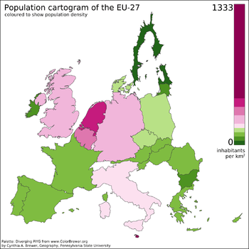
Some maps, called cartograms, have the scale deliberately distorted to reflect information other than land area or distance. For example, this map (at the right) of Europe has been distorted to show population distribution, while the rough shape of the continent is still discernible.
Another example of distorted scale is the famous London Underground map. The basic geographical structure is respected but the tube lines (and the River Thames) are smoothed to clarify the relationships between stations. Near the center of the map stations are spaced out more than near the edges of map.
Further inaccuracies may be deliberate. For example, cartographers may simply omit military installations or remove features solely in order to enhance the clarity of the map. For example, a road map may not show railroads, smaller waterways or other prominent non-road objects, and even if it does, it may show them less clearly (e.g. dashed or dotted lines/outlines) than the main roads. Known as decluttering, the practice makes the subject matter that the user is interested in easier to read, usually without sacrificing overall accuracy. Software-based maps often allow the user to toggle decluttering between ON, OFF and AUTO as needed. In AUTO the degree of decluttering is adjusted as the user changes the scale being displayed.
Map types and projections

Maps of the world or large areas are often either 'political' or 'physical'. The most important purpose of the political map is to show territorial borders; the purpose of the physical is to show features of geography such as mountains, soil type or land use including infrastructure such as roads, railroads and buildings. Topographic maps show elevations and relief with contour lines or shading. Geological maps show not only the physical surface, but characteristics of the underlying rock, fault lines, and subsurface structures. Maps that depict the surface of the Earth also use a projection, a way of translating the three-dimensional real surface of the geoid to a two-dimensional picture. Perhaps the best-known world-map projection is the Mercator projection, originally designed as a form of nautical chart. Aeroplane pilots use aeronautical charts based on a Lambert conformal conic projection, in which a cone is laid over the section of the earth to be mapped. The cone intersects the sphere (the earth) at one or two parallels which are chosen as standard lines. This allows the pilots to plot a great-circle route approximation on a flat, two-dimensional chart.
- Azimuthal or Gnomonic map projections are often used in planning air routes due to their ability to represent great circles as straight lines.
- Richard Edes Harrison produced a striking series of maps during and after World War II for Fortune magazine. These used "bird's eye" projections to emphasise globally strategic "fronts" in the air age, pointing out proximities and barriers not apparent on a conventional rectangular projection of the world.
Electronic maps
From the last quarter of the 20th century, the indispensable tool of the cartographer has been the computer. Much of cartography, especially at the data-gathering survey level, has been subsumed by Geographic Information Systems (GIS). The functionality of maps has been greatly advanced by technology simplifying the superimposition of spatially located variables onto existing geographical maps. Having local information such as rainfall level, distribution of wildlife, or demographic data integrated within the map allows more efficient analysis and better decision making. In the pre-electronic age such superimposition of data led Dr. John Snow to identify the location of an outbreak of cholera. Today, it is used by agencies of the human kind, as diverse as wildlife conservationists and militaries around the world.

Even when GIS is not involved, most cartographers now use a variety of computer graphics programs to generate new maps.
Interactive, computerised maps are commercially available, allowing users to zoom in or zoom out (respectively meaning to increase or decrease the scale), sometimes by replacing one map with another of different scale, centered where possible on the same point. In-car global navigation satellite systems are computerised maps with route-planning and advice facilities which monitor the user's position with the help of satellites. From the computer scientist's point of view, zooming in entails one or a combination of:
- replacing the map by a more detailed one
- enlarging the same map without enlarging the pixels, hence showing more detail by removing less information compared to the less detailed version
- enlarging the same map with the pixels enlarged (replaced by rectangles of pixels); no additional detail is shown, but, depending on the quality of one's vision, possibly more detail can be seen; if a computer display does not show adjacent pixels really separate, but overlapping instead (this does not apply for an LCD, but may apply for a cathode ray tube), then replacing a pixel by a rectangle of pixels does show more detail. A variation of this method is interpolation.
For example:
- Typically (2) applies to a Portable Document Format (PDF) file or other format based on vector graphics. The increase in detail is, of course, limited to the information contained in the file: enlargement of a curve may eventually result in a series of standard geometric figures such as straight lines, arcs of circles or splines.
- (2) may apply to text and (3) to the outline of a map feature such as a forest or building.
- (1) may apply to the text as needed (displaying labels for more features), while (2) applies to the rest of the image. Text is not necessarily enlarged when zooming in. Similarly, a road represented by a double line may or may not become wider when one zooms in.
- The map may also have layers which are partly raster graphics and partly vector graphics. For a single raster graphics image (2) applies until the pixels in the image file correspond to the pixels of the display, thereafter (3) applies.
See also: Webpage (Graphics), PDF (Layers), MapQuest, Google Maps, Google Earth, OpenStreetMap or Yahoo! Maps.
Conventional signs
The various features shown on a map are represented by conventional signs or symbols. For example, colors can be used to indicate a classification of roads. Those signs are usually explained in the margin of the map, or on a separately published characteristic sheet.[1]
Some cartographers prefer to make the map cover practically the entire screen or sheet of paper, leaving no room "outside" the map for information about the map as a whole. These cartographers typically place such information in an otherwise "blank" region "inside" the map -- cartouche, map legend, title, compass rose, bar scale, etc. In particular, some maps contain smaller "sub-maps" in otherwise blank regions—often one at a much smaller scale showing the whole globe and where the whole map fits on that globe, and a few showing "regions of interest" at a larger scale in order to show details that wouldn't otherwise fit. Occasionally sub-maps use the same scale as the large map—a few maps of the contiguous United States include a sub-map to the same scale for each of the two non-contiguous states.
Labeling
To communicate spatial information effectively, features such as rivers, lakes, and cities need to be labeled. Over centuries cartographers have developed the art of placing names on even the densest of maps. Text placement or name placement can get mathematically very complex as the number of labels and map density increases. Therefore, text placement is time-consuming and labor-intensive, so cartographers and GIS users have developed automatic label placement to ease this process.[2][3]
Non-geographical spatial maps
Maps exist of the solar system, and other cosmological features such as star maps. In addition maps of other bodies such as the Moon and other planets are technically not geographical maps.
Non spatial maps
Diagrams such as schematic diagrams and Gantt charts and treemaps display logical relationships between items, and do not display spatial relationships at all.
Some maps, for example the London Underground map, are topological maps. Topological in nature, the distances are completely unimportant; only the connectivity is significant.
General-purpose maps
General-purpose maps provide many types of information on one map. Most atlas maps, wall maps, and road maps fall into this category. The following are some features that might be shown on a general-purpose maps: bodies of water, roads, railway lines, parks, elevations, towns and cities, political boundaries, latitude and longitude, national and provincial parks. These maps give a broad understanding of location and features of an area. The reader may gain an understanding of the type of landscape, the location of urban places, and the location of major transportation routes all at once.
Types of maps
- Atlas
- Climatic map
- Physical map
- Political map
- Street map
- Thematic map
- Weather map
- Relief map
- World map
Legal regulation
Some countries required that all published maps represent their national claims regarding border disputes. For example:
- Within Russia, Google Maps shows Crimea as part of Russia.[4]
- Both India and the People's Republic of China require all maps show areas subject to the Sino-Indian border dispute in their own favor[5]
In 2010, the People's Republic of China began requiring that all online maps be served from within China, to enforce compliance with its laws.[6]
See also
- General
- Map designing and types
|
- Modern maps
|
|
- Map history
|
|
- Related topics
Notes
- References
- ↑ Ordnance Survey, Explorer Map Symbols; Swisstopo, Conventional Signs; United States Geological Survey, Topographic Map Symbols.
- ↑ Imhof, E., “Die Anordnung der Namen in der Karte,” Annuaire International de Cartographie II, Orell-Füssli Verlag, Zürich, 93-129, 1962.
- ↑ Freeman, H., Map data processing and the annotation problem, Proc. 3rd Scandinavian Conf. on Image Analysis, Chartwell-Bratt Ltd. Copenhagen, 1983.
- ↑ http://www.npr.org/blogs/thetwo-way/2014/04/12/302337754/google-maps-displays-crimean-border-differently-in-russia-u-s
- ↑ "Google charts a careful course through Asia's maps". Reuters.
- ↑ "China officially announces crackdown on maps, annotations". Ogle Earth.
- Bibliography
- David Buisseret, ed., Monarchs, Ministers and Maps: The Emergence of Cartography as a Tool of Government in Early Modern Europe. Chicago: University of Chicago Press, 1992, ISBN 0-226-07987-2
- Denis E. Cosgrove (ed.) Mappings. Reaktion Books, 1999 ISBN 1-86189-021-4
- Freeman, Herbert, Automated Cartographic Text Placement. White paper.
- Ahn, J. and Freeman, H., “A program for automatic name placement,” Proc. AUTO-CARTO 6, Ottawa, 1983. 444-455.
- Freeman, H., “Computer Name Placement,” ch. 29, in Geographical Information Systems, 1, D.J. Maguire, M.F. Goodchild, and D.W. Rhind, John Wiley, New York, 1991, 449-460.
- Mark Monmonier, How to Lie with Maps, ISBN 0-226-53421-9
- O'Connor, J.J. and E.F. Robertson, The History of Cartography. Scotland : St. Andrews University, 2002.
External links
| Wikiquote has quotations related to: Map |
- International Cartographic Association (ICA), the world body for mapping and GIScience professionals
| Wikimedia Commons has media related to Maps. |
- Geography and Maps, an Illustrated Guide, by the staff of the U.S. Library of Congress.
- Historical Maps from the Hargrett Library Collection (University of Georgia) - browse over 1000 maps from as early as 1544. DjVu format; requires free plugin or JAVA
- The History of Cartography Project at the University of Wisconsin, a comprehensive research project in the history of maps and mapping
- Mapping History Project - University of Oregon
- Mapping the World The Lionel Pincus and Princess Firyal Map Division at The New York Public Library
- Online map collections at the Library of Congress
- Online map collections at the Bibliothèque nationale de France
- Maps Department at The British Library
- John H.W. Stuckenberg Map Digital Collection at Gettysburg College
- Terra Library: Geography Research Assistant
| ||||||||||||||||||
| ||||||||||||||||||||||||||||||||||||||||||||||||||||||||||||||||||||||||||||||||||||||||||||||||||||||