History of the graphical user interface

| History of computing |
|---|
| Hardware |
| Software |
| Computer science |
| Modern concepts |
| Timeline of computing |
|
The history of the graphical user interface, understood as the use of graphic icons and a pointing device to control a computer, covers a five-decade span of incremental refinements, built on some constant core principles. Several vendors have created their own windowing systems based on independent code, but with basic elements in common that define the WIMP "window, icon, menu and pointing device" paradigm.
There have been important technological achievements, and enhancements to the general interaction in small steps over previous systems. There have been a few significant breakthroughs in terms of use, but the same organizational metaphors and interaction idioms are still in use. Although many GUI operating systems are controlled by using a mouse, the keyboard can also be used with keyboard shortcuts or arrow keys. The interface developments described, below, have been summarized and omit many details in the interest of brevity. The influence of game computers and joystick operation has been omitted.
Initial developments

Early dynamic information devices such as radar displays, where input devices were used for direct control of computer-created data, set the basis for later improvements of graphical interfaces.[2] Some early cathode-ray-tube (CRT) screens used a lightpen, rather than a mouse, as the pointing device.
The concept of a multi-panel windowing system was introduced by the first real-time graphic display systems for computers: the SAGE Project and Ivan Sutherland's Sketchpad.
Augmentation of Human Intellect (NLS)
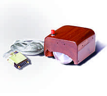
In the 1960s, Doug Engelbart's Augmentation of Human Intellect project at the Augmentation Research Center at SRI International in Menlo Park, California developed the oN-Line System (NLS). This computer incorporated a mouse-driven cursor and multiple windows used to work on hypertext. Engelbart had been inspired, in part, by the memex desk-based information machine suggested by Vannevar Bush in 1945.
Much of the early research was based on how young children learn. So, the design was based on the childlike primitives of hand-eye coordination, rather than use of command languages, user-defined macro procedures, or automated transformations of data as later used by adult professionals.
Xerox PARC
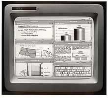
Engelbart's work directly led to the advances at Xerox PARC. Several people went from SRI to Xerox PARC in the early 1970s. In 1973, Xerox PARC developed the Alto personal computer. It had a bitmapped screen, and was the first computer to demonstrate the desktop metaphor and graphical user interface (GUI). It was not a commercial product, but several thousand units were built and were heavily used at PARC, as well as other XEROX offices, and at several universities for many years. The Alto greatly influenced the design of personal computers during the late 1970s and early 1980s, notably the Three Rivers PERQ, the Apple Lisa and Macintosh, and the first Sun workstations.
The GUI was first developed at Xerox PARC by Alan Kay, Larry Tesler, Dan Ingalls, David Smith and a number of other researchers. It used windows, icons, and menus (including the first fixed drop-down menu) to support commands such as opening files, deleting files, moving files, etc. In 1974, work began at PARC on Gypsy, the first bitmap What-You-See-Is-What-You-Get (WYSIWYG) cut & paste editor. In 1975, Xerox engineers demonstrated a Graphical User Interface "including icons and the first use of pop-up menus".[3]
In 1981 Xerox introduced a pioneering product, Star, a workstation incorporating many of PARC's innovations. Although not commercially successful, Star greatly influenced future developments, for example at Apple, Microsoft and Sun Microsystems.[4]
Early developments
Xerox Alto and Xerox Star
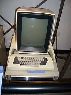
The Xerox Alto (and later Xerox Star) was an early personal computer developed at Xerox PARC in 1973. It was the first computer to use the desktop metaphor and mouse-driven graphical user interface (GUI).
It was not a commercial product, but several thousand units were built and were heavily used at PARC, other Xerox facilities, at least one government facility and at several universities for many years. The Alto greatly influenced the design of some personal computers in the following decades, notably the Apple Macintosh and the first Sun workstations.
SGI 1000 series and MEX
Founded 1982, SGI introduced the IRIS 1000 Series[5] in 1983.[6] The first graphical terminals (IRIS 1000) shipped in late 1983, and the corresponding workstation model (IRIS 1400) was released in mid-1984. The machines used an early version of the MEX windowing system on top of the GL2 Release 1 operating environment.[7] Examples of the MEX user interface can be seen in a 1988 article in the journal "Computer Graphics",[8] while earlier screenshots can not be found. The first commercial GUI-based systems, these did not find widespread use as to their (discounted) academic list price of $22,500 and $35,700 for the IRIS 1000 and IRIS 1400, respectively.[6] However, these systems were commercially successful enough to start SGI's business as one of the main graphical workstation vendors. In later revisions of graphical workstations, SGI switched to the X window system, which had been developed starting at MIT since 1984 and which became the standard for UNIX workstations.
Apple Lisa and Macintosh (and later, the Apple IIgs)
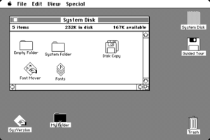

Beginning in 1979, started by Steve Jobs and led by Jef Raskin, the Apple Lisa and Macintosh teams at Apple Computer (which included former members of the Xerox PARC group) continued to develop such ideas. The Lisa, released in 1983, featured a high-resolution stationary-based (document-centric) graphical interface atop an advanced hard disk based OS that featured such things as preemptive multitasking and graphically oriented interprocess communication. The comparatively simplified Macintosh, released in 1984 and designed to be lower in cost, was the first commercially successful product to use a multi-panel window interface. A desktop metaphor was used, in which files looked like pieces of paper. File directories looked like file folders. There were a set of desk accessories like a calculator, notepad, and alarm clock that the user could place around the screen as desired; and the user could delete files and folders by dragging them to a trash-can icon on the screen. The Macintosh, in contrast to the Lisa, used a program-centric rather than document-centric design. Apple revisited the document-centric design, in a limited manner, much later with OpenDoc.
There is still some controversy over the amount of influence that Xerox's PARC work, as opposed to previous academic research, had on the GUIs of the Apple Lisa and Macintosh, but it is clear that the influence was extensive, because first versions of Lisa GUIs even lacked icons. These prototype GUIs are at least mouse-driven, but completely ignored the WIMP ( "window, icon, menu, pointing device") concept. Screenshots of first GUIs of Apple Lisa prototypes show the early designs. Note also that Apple engineers visited the PARC facilities (Apple secured the rights for the visit by compensating Xerox with a pre-IPO purchase of Apple stock) and a number of PARC employees subsequently moved to Apple to work on the Lisa and Macintosh GUI. However, the Apple work extended PARC's considerably, adding manipulatable icons, and drag&drop manipulation of objects in the file system (see Macintosh Finder) for example. A list of the improvements made by Apple, beyond the PARC interface, can be read at Folklore.org.[9] Jef Raskin warns that many of the reported facts in the history of the PARC and Macintosh development are inaccurate, distorted or even fabricated, due to the lack of usage by historians of direct primary sources.[10]
In 1984, Apple released a television commercial which introduced the Apple Macintosh during the telecast of Super Bowl XVIII by CBS,[11] with allusions to George Orwell's noted novel, Nineteen Eighty-Four. The commercial was aimed at making people think about computers, identifying the user-friendly interface as a personal computer which departed from previous business-oriented systems,[12] and becoming a signature representation of Apple products.[13]
In 1986 the Apple IIgs was launched, a very advanced model of the successful Apple II series, based on 16-bit technology (in fact, virtually two machines into one). It came with a new operating system, the Apple GS/OS, which features a Finder-like GUI, very similar to that of the Macintosh series, able to deal with the advanced graphic abilities of its Video Graphics Chip (VGC).
Graphical Environment Manager (GEM)
Digital Research (DRI) created the Graphical Environment Manager (GEM) as an add-on program for personal computers. GEM was developed to work with existing CP/M and MS-DOS operating systems on business computers such as IBM-compatibles. It was developed from DRI software, known as GSX, designed by a former PARC employee. The similarity to the Macintosh desktop led to a copyright lawsuit from Apple Computer, and a settlement which involved some changes to GEM. This was to be the first of a series of 'look and feel' lawsuits related to GUI design in the 1980s.
GEM received widespread use in the consumer market from 1985, when it was made the default user interface built into the Atari TOS operating system of the Atari ST line of personal computers. It was also bundled by other computer manufacturers and distributors, such as Amstrad. Later, it was distributed with the best-sold Digital Research version of DOS for IBM PC compatibles, the DR-DOS 6.0. The GEM desktop faded from the market with the withdrawal of the Atari ST line in 1992 and with the popularity of the Microsoft Windows 3.0 in the PC front around the same period of time.
DeskMate
Tandy's DeskMate appeared in the early 1980s on its TRS-80 machines and was ported to its Tandy 1000 range in 1984. Like most PC GUIs of the time, it depended on a disk operating system such as TRS-DOS or MS-DOS. The application was popular at the time and included a number of programs like Draw, Text and Calendar, as well as attracting outside investment such as Lotus 1-2-3 for DeskMate.
MSX-View
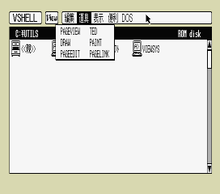
MSX-View was developed for MSX computers by ASCII Corporation and HAL Laboratory. MSX-View contains software such as Page Edit, Page View, Page Link, VShell, VTed, VPaint and VDraw. An external version of the built-in MSX View of the Panasonic FS-A1GT was released as an add-on for the Panasonic FS-A1ST on disk instead of 512kB ROM DISK.
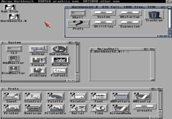
Amiga Intuition and the Workbench
The Amiga computer was launched by Commodore in 1985 with a GUI called Workbench. Workbench was based on an internal engine developed mostly by RJ Mical, called Intuition, which drove all the input events. The first versions used a blue/orange/white/black default palette, which was selected for high contrast on televisions and composite monitors. Workbench presented directories as drawers to fit in with the "workbench" theme. Intuition was the widget and graphics library that made the GUI work. It was driven by user events through the mouse, keyboard, and other input devices.
Due to a mistake made by the Commodore sales department, the first floppies of AmigaOS (released with the Amiga1000) named the whole OS "Workbench". Since then, users and CBM itself referred to "Workbench" as the nickname for the whole AmigaOS (including Amiga DOS, Extras, etc.). This common consent ended with release of version 2.0 of AmigaOS, which re-introduced proper names to the installation floppies of AmigaDOS, Workbench, Extras, etc.
Starting with Workbench 1.0, AmigaOS treated the Workbench as a backdrop, borderless window sitting atop a blank screen. With the introduction of AmigaOS 2.0, however, the user was free to select whether the main Workbench window appeared as a normally layered window, complete with a border and scrollbars, through a menu item.
Amiga users were able to boot their computer into a command line interface (also known as the CLI or Amiga Shell). This was a keyboard-based environment without the Workbench GUI. Later they could invoke it with the CLI/SHELL command "LoadWB" which loaded Workbench GUI.
One major difference between other OS's of the time (and for some time after) was the Amiga's fully multi-tasking operating system, a powerful built-in animation system using a hardware blitter and copper and 4 channels of 26 kHz 8-bit sampled sound. This made the Amiga the first multi-media computer years before other OS's.
Like most GUIs of the day, Amiga's Intuition followed Xerox's, and sometimes Apple's, lead. But a CLI was included which dramatically extended the functionality of the platform. However, the CLI/Shell of Amiga is not just a simple text-based interface like in MS-DOS, but another graphic process driven by Intuition, and with the same gadgets included in Amiga's graphics.library. The CLI/Shell interface integrates itself with the Workbench, sharing privileges with the GUI.
The Amiga Workbench evolved over the 1990s, even after Commodore's 1994 bankruptcy.
Acorn BBC Master Compact

Acorn's 8-bit BBC Master Compact shipped with Acorn's first public GUI interface in 1986.[14] Little commercial software, beyond that included on the Welcome disk, was ever made available for the system, despite the claim by Acorn at the time that "the major software houses have worked with Acorn to make over 100 titles available on compilation discs at launch".[15] The most avid supporter of the Master Compact appeared to be Superior Software, who produced and specifically labelled their games as 'Master Compact' compatible.
Arthur / RISC OS
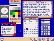
RISC OS /rɪskoʊˈɛs/[16] is a series of graphical user interface-based computer operating systems (OSes) designed for ARM architecture systems. It takes its name from the RISC (Reduced Instruction Set Computing) architecture supported. The OS was originally developed by Acorn Computers for use with their 1987 range of Archimedes personal computers using the Acorn RISC Machine processors. It comprises a command-line interface and desktop environment with a windowing system.
Originally branded as the Arthur 1.20 the subsequent Arthur 2 release was shipped under the name RISC OS 2.
From 1988 to 1998, the OS was bundled with nearly every ARM-based Acorn computer model, including the Archimedes range, RiscPC, NewsPad and A7000. A version of the OS (called NCOS) was used in Oracle's Network Computer and compatible systems. After the breakup of Acorn in 1998, development of the OS was forked and separately continued by several companies, including RISCOS Ltd, Pace Micro Technology and Castle Technology. Since 1998 it has been bundled with a number of ARM-based desktop computers such as the Iyonix[17] and A9home. As of 2012, the OS remains forked and is independently developed by RISCOS Ltd and the RISC OS Open community.
Most recent stable versions run on the ARMv3/ARMv4 RiscPC[18] (or under emulation via VirtualAcorn or RPCEmu), the ARMv5 Iyonix,[19] Raspberry Pi[20][21][22] and ARMv7 Cortex-A8 processors[23][24] (such as that used in the BeagleBoard and Touch Book). In 2011, a port for the Cortex-A9 PandaBoard was announced[25]
Desktop
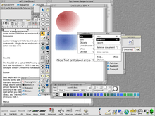
The WIMP interface incorporates three mouse buttons (named Select, Menu and Adjust), context-sensitive menus, window order control (i.e. send to back) and dynamic window focus (a window can have input focus at any position on the stack). The Icon bar (Dock) holds icons which represent mounted disc drives, RAM discs, running applications, system utilities and docked: Files, Directories or inactive Applications. These icons have context-sensitive menus and support drag-and-drop behaviour. They represent the running application as a whole, irrespective of whether it has open windows.
The GUI is centred around the concept of files. The Filer displays the contents of a disc. Applications are run from the Filer view and files can be dragged to the Filer view from applications to perform saves. Application directories are used to store applications. The OS differentiates them from normal directories through the use of a pling (exclamation mark, also called shriek) prefix. Double-clicking on such a directory launches the application rather than opening the directory. The application's executable files and resources are contained within the directory, but normally they remain hidden from the user. Because applications are self-contained, this allows drag-and-drop installation and removal.
The RISC OS Style Guide encourages a consistent look and feel across applications. This was introduced in RISC OS 3 and specifies application appearance and behaviour. Acorn's own main bundled applications were not updated to comply with the guide until RISCOS Ltd's Select release in 2001.[26]
Font manager
The outline fonts manager provides spatial anti-aliasing of fonts, the OS being the first operating system to include such a feature,[27][28][29][30] having included it since before January 1989.[31] Since 1994, in RISC OS 3.5, it has been possible to use an outline anti-aliased font in the WindowManager for UI elements, rather than the bitmap system font from previous versions.[32]
MS-DOS file managers and utility suites
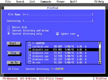
Because most of the very early IBM PC and compatibles lacked any common true graphical capability (they used the 80-column basic text mode compatible with the original MDA display adapter), a series of file managers arose, including Microsoft's DOS Shell, which features typical GUI elements as menus, push buttons, lists with scrollbars and mouse pointer. The name text-based user interface was later invented to name this kind of interface. Many MS-DOS text mode applications, like the default text editor for MS-DOS 5.0 (and related tools, like QBasic), also used the same philosophy. The IBM DOS Shell included with IBM DOS 5.0 (circa 1992) supported both text display modes and actual graphics display modes, making it both a TUI and a GUI, depending on the chosen mode.
Advanced file managers for MS-DOS were able to redefine character shapes with EGA and better display adapters, giving some basic low resolution icons and graphical interface elements, including an arrow (instead of a coloured cell block) for the mouse pointer. When the display adapter lacks the ability to change the character's shapes, they default to the CP437 character set found in the adapter's ROM. Some popular utility suites for MS-DOS, as Norton Utilities (pictured) and PC Tools used these techniques as well.
DESQview was a text mode multitasking program introduced in July 1985. Running on top of MS-DOS, it allowed users to run multiple DOS programs concurrently in windows. It was the first program to bring multitasking and windowing capabilities to a DOS environment in which existing DOS programs could be used. DESQview was not a true GUI but offered certain components of one, such as resizable, overlapping windows and mouse pointing.
Applications under MS-DOS with proprietary GUIs
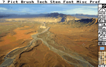
Before the MS-Windows age, and with the lack of a true common GUI under MS-DOS, most graphical applications which worked with EGA, VGA and better graphic cards had proprietary built-in GUIs. One of the best known such graphical applications was Deluxe Paint, a popular painting software with a typical WIMP interface.
The original Adobe Acrobat Reader executable file for MS-DOS was able to run on both the standard Windows 3.x GUI and the standard DOS command prompt. When it was launched from the command prompt, on a machine with a VGA graphics card, it provided its own GUI.
Microsoft Windows (16-bit versions)

Windows 1.0, a GUI for the MS-DOS operating system was released in 1985.[33] The market's response was less than stellar.[34] Windows 2.0 followed, but it wasn't until the 1990 launch of Windows 3.0, based on Common User Access that its popularity truly exploded. The GUI has seen minor redesigns since, mainly the networking enabled Windows 3.11 and its Win32s 32-bit patch. The 16-bit line of MS Windows were discontinued with the introduction of Windows 95 and Windows NT 32-bit based architecture in the 1990s. See the next section.

The main window of a given application can occupy the full screen in maximized status. The users must then to switch between maximized applications using the Alt+Tab keyboard shortcut; no alternative with the mouse except for de-maximize. When none of the running application windows are maximized, switching can be done by clicking on a partially visible window, as is the common way in other GUIs.
In 1988, Apple sued Microsoft for copyright infringement of the LISA and Apple Macintosh GUI. The court case lasted 4 years before almost all of Apple's claims were denied on a contractual technicality. Subsequent appeals by Apple were also denied. Microsoft and Apple apparently entered a final, private settlement of the matter in 1997.
GEOS

GEOS was launched in 1986. Originally written for the 8-bit home computer Commodore 64 and shortly after, the Apple II series. The name was later used by the company as PC/Geos for IBM PC systems, then Geoworks Ensemble. It came with several application programs like a calendar and word processor, and a cut-down version served as the basis for America Online's DOS client. Compared to the competing Windows 3.0 GUI it could run reasonably well on simpler hardware, but its developer had a restrictive policy towards third-party developers that prevented it from becoming a serious competitor. And it was targeted at 8-bit machines and the 16-bit computer age was dawning.
The X Window System
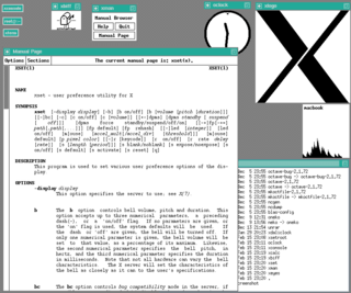
The standard windowing system in the Unix world is the X Window System (commonly X11 or X), first released in the mid-1980s. The W Window System (1983) was the precursor to X; X was developed at MIT as Project Athena. Its original purpose was to allow users of the newly emerging graphic terminals to access remote graphics workstations without regard to the workstation's operating system or the hardware. Due largely to the availability of the source code used to write X, it has become the standard layer for management of graphical and input/output devices and for the building of both local and remote graphical interfaces on virtually all Unix, Linux and other Unix-like operating systems, with the notable exceptions of Mac OS X and Android.
X allows a graphical terminal user to make use of remote resources on the network as if they were all located locally to the user by running a single module of software called the X server. The software running on the remote machine is called the client application. X's network transparency protocols allow the display and input portions of any application to be separated from the remainder of the application and 'served up' to any of a large number of remote users. X is available today as free software.
NeWS

The PostScript-based NeWS (Network extensible Window System) was developed by Sun Microsystems in the mid-1980s. For several years SunOS included a window system combining NeWS and the X Window System. Although NeWS was considered technically elegant by some commentators, Sun eventually dropped the product. Unlike X, NeWS was always proprietary software.
The 1990s: Mainstream usage of the desktop
The widespread adoption of the PC platform at homes and small business popularized computers among people with no formal training. This created a fast-growing market, opening an opportunity for commercial exploitation and of easy-to-use interfaces and making economically viable the incremental refinement of the existing GUIs for home systems.
Also, the spreading of Highcolor and True Color capabilities of display adapters providing thousands and millions of colors, along with faster CPUs and accelerated graphic cards, cheaper RAM, storage devices up to an order of magnitude larger (from megabytes to gigabytes) and larger bandwidth for telecom networking at lower cost helped to create an environment in which the common user was able to run complicated GUIs which began to favor aesthetics.
Windows 95 and "a computer in every home"

- Main article: Windows 95. See also: Windows NT.
After Windows 3.11, Microsoft began to develop a new consumer-oriented version of the operating system. Windows 95 was intended to integrate Microsoft's formerly separate MS-DOS and Windows products and included an enhanced version of DOS, often referred to as MS-DOS 7.0. It also featured a significant redesign of the GUI, dubbed "Cairo". While Cairo never really materialized, parts of Cairo found their way into subsequent versions of the operating system starting with Windows 95. Both Win95 and WinNT could run 32-bit applications, and could exploit the abilities of the Intel 80386 CPU, as the preemptive multitasking and up to 4GiB of linear address memory space. Windows 95 was touted as a 32-bit based operating system but it was actually based on a hybrid kernel (VWIN32.VXD) with the 16-bit user interface (USER.EXE) and graphic device interface (GDI.EXE) of Windows for Workgroups (3.11), which had 16-bit kernel components with a 32-bit subsystem (USER32.DLL and GDI32.DLL) that allowed it to run native 16-bit applications as well as 32-bit applications. In the marketplace, Windows 95 was an unqualified success, promoting a general upgrade to 32-bit technology, and within a year or two of its release had become the most successful operating system ever produced.
Accompanied by an extensive marketing campaign,[35] Windows 95 was a major success in the marketplace at launch and shortly became the most popular desktop operating system.
Windows 95 saw the beginning of the browser wars, when the World Wide Web began receiving a great deal of attention in the popular culture and mass media. Microsoft at first did not see potential in the Web, and Windows 95 was shipped with Microsoft's own online service called The Microsoft Network, which was dial-up only and was used primarily for its own content, not internet access. As versions of Netscape Navigator and Internet Explorer were released at a rapid pace over the following few years, Microsoft used its desktop dominance to push its browser and shape the ecology of the web mainly as a monoculture.
Windows 95 evolved through the years into Windows 98 and Windows ME. Windows ME was the last in the line of the Windows 3.x-based operating systems from Microsoft. Windows underwent a parallel 32-bit evolutionary path, where Windows NT 3.1 was released in 1993. Windows NT (for New Technology)[36] was a native 32-bit operating system with a new driver model, was unicode-based, and provided for true separation between applications. Windows NT also supported 16-bit applications in an NTVDM, but it did not support VXD based drivers. Windows 95 was supposed to be released before 1993 as the predecessor to Windows NT. The idea was to promote the development of 32-bit applications with backward compatibility - leading the way for more successful NT release. After multiple delays, Windows 95 was released without unicode and used the VXD driver model. Windows NT 3.1 evolved to Windows NT 3.5, 3.51 and then 4.0 when it finally shared a similar interface with its Windows 9x desktop counterpart and included a START button. The evolution continued with Windows 2000, Windows XP, Windows Vista, then Windows 7. Windows XP and higher were also made available in 64-bit modes. Windows server products branched off with the introduction of Windows Server 2003 (available in 32-bit and 64-bit IA64 or x64), then Windows Server 2008 and then Windows Server 2008 R2. Windows 2000 and XP shared the same basic GUI although XP introduced Visual Styles. With Windows 98, the Active Desktop theme was introduced, allowing an HTML approach for the desktop, but this feature was coldly received by customers, who frequently disabled it. At the end, Windows Vista definitively discontinued it, but put a new SideBar on the desktop.
Mac OS
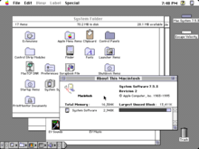
The Macintosh's GUI has been revised multiple times since 1984, with major updates including System 7 and Mac OS 8. It underwent its largest revision to date with the introduction of the "Aqua" interface in 2001's Mac OS X. It was a new operating system built primarily on technology from NeXTStep with UI elements of the original Mac OS grafted on. Mac OS X uses a technology known as Quartz (graphics layer), for graphics rendering and drawing on-screen. Some interface features of Mac OS X are inherited from NeXTStep (such as the Dock, the automatic wait cursor, or double-buffered windows giving a solid appearance and flicker-free window redraws), while others are inherited from the old Mac OS operating system (the single system-wide menu-bar). Mac OS X v10.3 introduced features to improve usability including Exposé, which is designed to make finding open windows easier.
With Mac OS X v10.4, new features were added, including Dashboard (a virtual alternate desktop for mini specific-purpose applications) and a search tool called Spotlight, which provides users with an option for searching through files instead of browsing through folders.
GUIs built on the X Window System

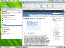
In the early days of X Window development, Sun Microsystems and AT&T attempted to push for a GUI standard called OPEN LOOK in competition with Motif. OPEN LOOK was a well-designed standard developed from scratch in conjunction with Xerox, while Motif was a collective effort that fell into place, with a look and feel patterned after Windows 3.11. Many who worked on OPEN LOOK at the time appreciated its design coherence. Motif prevailed in the UNIX GUI battles and became the basis for the Common Desktop Environment (CDE). CDE was based on Visual User Environment (VUE), a proprietary desktop from Hewlett-Packard that in turn was based on the Motif look and feel.
In the late 1990s, there was significant growth in the Unix world, especially among the free software community. New graphical desktop movements grew up around Linux and similar operating systems, based on the X Window System. A new emphasis on providing an integrated and uniform interface to the user brought about new desktop environments, such as KDE Plasma Desktop, GNOME and Xfce which have supplanted CDE in popularity on both Unix and Unix-like operating systems. The Xfce, KDE and GNOME look and feel each tend to undergo more rapid change and less codification than the earlier OPEN LOOK and Motif environments.
Amiga
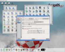
Later releases added improvements over the original Workbench, like support for high-color Workbench screens, context menus, and embossed 2D icons with pseudo-3D aspect. Some Amiga users preferred alternative interfaces to standard Workbench, such as Directory Opus Magellan.
The use of improved, third-party GUI engines became common amongst users who preferred more attractive interfaces – such as Magic User Interface (MUI), and ReAction. These object-oriented graphic engines driven by user interface classes and methods were then standardized into the Amiga environment and changed Amiga Workbench to a complete and modern guided interface, with new standard gadgets, animated buttons, true 24-bit-color icons, increased use of wallpapers for screens and windows, alpha channel, transparencies and shadows as any modern GUI provides.
Modern derivatives of Workbench are Ambient for MorphOS, Scalos, Workbench for AmigaOS 4 and Wanderer for AROS. There is a brief article on Ambient and descriptions of MUI icons, menus and gadgets at aps.fr and images of Zune stay at main AROS site.
Use of object oriented graphic engines dramatically changes the look and feel of a GUI to match actual styleguides.
OS/2
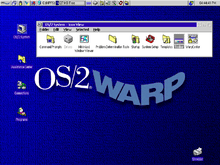
Originally collaboratively developed by Microsoft and IBM to replace DOS, OS/2 version 1.0 (released in 1987) had no GUI at all. Version 1.1 (released 1988) included Presentation Manager (PM), an implementation of IBM Common User Access, which looked a lot like the later Windows 3.1 UI. After the split with Microsoft, IBM developed the Workplace Shell (WPS) for version 2.0 (released in 1992), a quite radical, object-oriented approach to GUIs. Microsoft later imitated much of this look in Windows 95.
NeXTSTEP

The NeXTSTEP user interface was used in the NeXT line of computers. NeXTSTEP's first major version was released in 1989. It used Display PostScript for its graphical underpinning. The NeXTSTEP interface's most significant feature was the Dock, carried with some modification into Mac OS X, and had other minor interface details that some found made it easier and more intuitive to use than previous GUIs. NeXTSTEP's GUI was the first to feature opaque dragging of windows in its user interface, on a comparatively weak machine by today's standards, ideally aided by high performance graphics hardware.
BeOS

BeOS was developed on custom AT&T Hobbit-based computers before switching to PowerPC hardware by a team led by former Apple executive Jean-Louis Gassée as an alternative to Mac OS. BeOS was later ported to Intel hardware. It used an object-oriented kernel written by Be, and did not use the X Window System, but a different GUI written from scratch. Much effort was spent by the developers to make it an efficient platform for multimedia applications. Be Inc. was acquired by PalmSource, Inc. (Palm Inc. at the time) in 2001. The BeOS GUI still lives in Haiku, an open source software reimplementation of the BeOS.
Current trends
Mobile devices
In 2007 with the iPhone[37] and later in 2010 with the introduction of the iPad,[38] Apple popularized the post-WIMP style of interaction for multi-touch screens, with those devices considered to be milestones in the development of mobile devices.[39][40]
Other portable devices such as MP3 players and cell phones have been a burgeoning area of deployment for GUIs in recent years. Since the mid-2000s, a vast majority of portable devices have advanced to having high-screen resolutions and sizes. (The iPhone 5's 1,136 × 640 pixel display is an example). Because of this, these devices have their own famed user interfaces and operating systems that have large homebrew communities dedicated to creating their own visual elements, such as icons, menus, wallpapers, and more. Post-WIMP interfaces are often used in these mobile devices, where the traditional pointing devices required by the desktop metaphor are not practical.
As high-powered graphics hardware draws considerable power and generates significant heat, many of the 3D effects developed between 2000 and 2010 are not practical on this class of device. This has led to the development of simpler interfaces making a design feature of two dimensionality such as exhibited by the Metro (Modern) UI first used in Windows 8 and the 2012 Gmail redesign.
3D user interface

In the 1st decade of the 21st century, the rapid development of GPUs led to a trend for the inclusion of 3D effects in window management. It is based in experimental research in User Interface Design trying to expand the expressive power of the existing toolkits in order to enhance the physical cues that allow for direct manipulation. New effects common to several projects are scale resizing and zooming, several windows transformations and animations (wobbly windows, smooth minimization to system tray...), composition of images (used for window drop shadows and transparency) and enhancing the global organization of open windows (zooming to virtual desktops, desktop cube, Exposé, etc.) The proof-of-concept BumpTop desktop combines a physical representation of documents with tools for document classification possible only in the simulated environment, like instant reordering and automated grouping of related documents.
These effects are popularized thanks to the widespread use of 3D video cards (mainly due to gaming) which allow for complex visual processing with low CPU use, using the 3D acceleration in most modern graphics cards to render the application clients in a 3D scene. The application window is drawn off-screen in a pixel buffer, and the graphics card renders it into the 3D scene.
This can have the advantage of moving some of the window rendering to the GPU on the graphics card and thus reducing the load on the main CPU, but the facilities that allow this must be available on the graphics card to be able to take advantage of this.
Examples of 3D user-interface software include XGL and Compiz from Novell, and AIGLX bundled with Red Hat Fedora. Quartz Extreme for Mac OS X and Windows 7 and Vista's Aero interface use 3D rendering for shading and transparency effects as well as Expose and Windows Flip and Flip 3D, respectively. Windows Vista uses Direct3D to accomplish this, whereas the other interfaces use OpenGL.
At the IEEE 7th Symposium on 3D User Interfaces, Ph.D. student Mengu Sukan, M.S. student Semih Energin and Prof. Steve Feiner won best poster for research and development of augmented reality, titled "Manipulating Virtual Objects in Hand-Held Augmented Reality using Stored Snapshots." The poster presents a set of interaction techniques that allow a user to first take snapshots of a scene using a tablet computer, and then jump back and forth between the snapshots, to revisit them virtually for interaction. By storing for each snapshot a still image of the scene, along with the camera position and orientation determined by computer vision software, this approach allows the overlaid 3D graphics to be dynamic and interactive. This makes it possible for the user to move and rotate virtual 3D objects from the vantage points of different locations, without the overhead of physically traveling between those locations. 3DUI attendees tried a real-time demo in which they laid out virtual furniture. They could rapidly transition between the live view and the viewpoints of multiple snapshots, as they moved and rotated items of virtual furniture, iteratively designing a desired layout.[41]
Virtual reality and presence
Virtual reality devices such as the Oculus Rift and Sony's Project Morpheus[42] aim to provide users with presence, a perception of full immersion into a virtual environment.
See also
- Windowing system
- Bill Atkinson
- The Blit (graphics terminal by Rob Pike, 1982)
- Direct manipulation interface
- Doug Engelbart's On-Line System
- Graphical user interface
- Text-based user interface
- History of computing hardware
- History of computer icons
- Ivan Sutherland's Sketchpad
- Jef Raskin
- Office of the future
- XGL
- AIGLX
- DirectFB
- Mezzo
- tiling window manager
- Macro command language
- Texting
- Skeuomorph
- Apple v. Microsoft
- IBM Common User Access
References
- ↑ "The computer mouse turns 40". Retrieved June 12, 2012.
- ↑ Clive Akass. "The men who really invented the GUI".
- ↑ History of PARC
- ↑ Mike Tuck. "The Real History of the GUI".
- ↑ "Sgi Iris Faq". Futuretech.blinkenlights.nl. Retrieved 2014-03-07.
- ↑ 6.0 6.1 "Hardware : Systems : IRIS 1000". sgistuff.net. Retrieved 2014-03-07.
- ↑ "History of IRIX". Ryan.tliquest.net. Retrieved 2014-03-07.
- ↑ "ConMan: a visual programming language for interactive graphics". Computer Graphics (Dx.doi.org) 22 (4): 103–111. 1988. doi:10.1145/378456.378494. Retrieved 2014-03-07.
- ↑ "On Xerox, Apple and Progress" (1996), Folklore.org.
- ↑ Jef Raskin. "Holes in Histories".
- ↑ Friedman, Ted (October 1997). "Apple's 1984: The Introduction of the Macintosh in the Cultural History of Personal Computers". Archived from the original on October 5, 1999.
- ↑ Friedman, Ted (2005). "Chapter 5: 1984". Electric Dreams: Computers in American Culture. New York University Press. ISBN 0-8147-2740-9.
- ↑ Grote, Patrick (October 29, 2006). "Review of Pirates of Silicon Valley Movie". DotJournal.com. Archived from the original on November 7, 2006. Retrieved January 24, 2014.
- ↑ Chris's Acorns: Master Compact
- ↑ [Acorn User October 1986 - News - Page 9]
- ↑ "About us: RISC OS Open Limited FAQ". RISC OS Open. Retrieved June 13, 2011.
- ↑ "Acorn announces distribution deal with Castle Technology for RISC based products". Press release (Acorn Computers Ltd). October 12, 1998. Archived from the original on May 6, 1999. Retrieved January 6, 2011.
(October 12th 1998), Cambridge, UK-Acorn announced today that it has completed negotiations with Castle Technology for them to distribute Acorn products.
|first1=missing|last1=in Authors list (help) - ↑ "Risc os 6 general faq". RISCOS Ltd. Retrieved January 31, 2011.
[RISC OS 6 is] suitable for Risc PC, A7000 and Virtual Acorn products.
- ↑ "RISC OS 5 features". Iyonix Ltd. Retrieved January 31, 2011.
All IYONIX pcs ship with RISC OS 5 in flash ROM.
- ↑ Lee, Jeffrey. "Newsround". The Icon Bar. Retrieved October 17, 2011.
- ↑ Holwerda, Thom (October 31, 2011). "Raspberry Pi To Embrace RISC OS". OSNews. Retrieved November 1, 2011.
- ↑ Dewhurst, Christopher (December 2011). "The London show 2011". Archive (magazine) 23 (3). p. 3.
- ↑ Farrell, Nick (April 27, 2009). "Snaps leak of RISC OS5 on Beagleboard". The Inquirer. Retrieved June 28, 2011.
A snap of an RISC OS 5, running on a Beagleboard device powered by a 600MHz ARM Cortex-A8 processor with a built-in graphics chip, has tipped up on the world wide wibble. The port developed by Jeffrey Lee is a breakthrough for the shared-source project because it has ported the OS without an army of engineers.
- ↑ "Cortex-A8 port status". RISC OS Open. Retrieved January 31, 2011.
[The port includes] a modified version of the RISC OS kernel containing support for (all) Cortex-A8 CPU cores.
- ↑ Lee, Jeffrey (August 2, 2011). "Have I Got Old News For You". The Icon Bar. Retrieved September 28, 2011.
[...] Willi Theiss has recently announced that he's been working on a port of RISC OS to the PandaBoard [...]
- ↑ Mellor, Phil (March 23, 2007). "An arbitrary number of possibly influential RISC OS things". The Icon Bar. Retrieved September 27, 2011.
Admittedly it wasn't until RISC OS Select was released, almost 10 years later, that the standard Acorn applications (Draw, Edit, and Paint) implemented the style guide's clipboard recommendations, but most products followed it with care.
- ↑ Round, Mark (February 26, 2004). "Emulating RISC OS under Windows". OSnews. OSNews. Retrieved May 12, 2011.
Many of the UI concepts that we take for granted were first pioneered in RISC OS, for instance: scalable anti-aliased fonts and an operating system extendable by 'modules', while most of the PC world was still on Windows 3.0.
- ↑ Ghiraddje (December 22, 2009). "The RISC OS GUI". Telcontar.net. Retrieved May 12, 2011.
Only with Mac OS X did any mainstream graphical interface provide the smoothly rendered, fractionally spaced type that Acorn accomplished in 1992 or earlier.
- ↑ Reimer, Jeremy (May 2005). "A History of the GUI". ArsTechnica. Retrieved May 25, 2011.
[...] in 1987, the UK-based company Acorn Computers introduced their [...] GUI, called "Arthur", also was the first to feature anti-aliased display of on-screen fonts, even in 16-color mode!
- ↑ Holwerda, Thom (June 23, 2005). "Screen Fonts: Shape Accuracy or On-Screen Readability?". OSNews. Retrieved June 13, 2011.
[...] it was RISC OS that had the first system-wide, intricate [...] font rendering in operating systems.
- ↑ Pountain, Dick (December 1988). "Screentest: Archie RISC OS" (PDF). Personal Computer World. p. 154. Retrieved January 14, 2011.
[ArcDraw] can also add text in multiple sizes and fonts to a drawing (including anti-aliased fonts)
- ↑ Acorn Computers Support Group Application Notice 253 - New features of RISC OS version 3.5
- ↑ "how-windows-came-to-be-windows-1". sbp-romania.com. Retrieved October 3, 2011.
- ↑ "history-computer.com". http://history-computer.com. Retrieved October 3, 2011.
- ↑ Washington Post (August 24, 1995). Windows "With Windows 95's Debut, Microsoft Scales Heights of Hype". Washington Post. Retrieved 11/8/2013. Check date values in:
|accessdate=(help) - ↑ Gates, Bill (1998-06-05). "Q&A: Protecting children from information on the Internet". Archived from the original on 2001-05-26. Retrieved 2005-06-26.
- ↑ Mather, John. iMania, Ryerson Review of Journalism, (February 19, 2007) Retrieved February 19, 2007
- ↑ "the iPad could finally spark demand for the hitherto unsuccessful tablet PC" --Eaton, Nick The iPad/tablet PC market defined?, Seattle Post-Intelligencer, 2010
- ↑ Bright, Peter Ballmer (and Microsoft) still doesn't get the iPad, Ars Technica, 2010
- ↑ "The iPad's victory in defining the tablet: What it means". Infoworld.
- ↑ Dedual, Nicolas (March 8, 2012). "Sukan, Feiner, and Energin receive Best Poster Award at IEEE 3DUI 2012" (ANNOUNCEMENT). Columbia University. Retrieved April 3, 2013.
- ↑
External links
- Raj Lal "User Interface evolution in last 50 years", Digital Design and Innovation Summit, San Francisco, Sept 20, 2013
- Jeremy Reimer. "A History of the GUI" Ars Technica. May 5, 2005.
- "User Interface Timeline" George Mason University
- Nathan Lineback. "The Graphical User Interface Gallery". Nathan's Toasty Technology Page.
- Oral history interview with Marvin L. Minsky, Charles Babbage Institute, University of Minnesota. Minsky describes artificial intelligence (AI) research at the Massachusetts Institute of Technology (MIT), including research in the areas of graphics, word processing, and time-sharing.
- Oral history interview with Ivan Sutherland, Charles Babbage Institute, University of Minnesota. Sutherland describes his tenure as head of ARPA's Information Processing Techniques Office (IPTO) from 1963 to 1965, including new projects in graphics and networking.
- Oral history interview with Charles A. Csuri, Charles Babbage Institute, University of Minnesota. Csuri recounts his art education and explains his transition to computer graphics in the mid-1960s, after receiving a National Science Foundation grant for research in graphics.
- GUIdebook: Graphical User Interface gallery
- VisiOn history – The first GUI for the PC
- mprove: Historical Overview of Graphical User Interfaces
- Anecdotes about the development of the Macintosh Hardware & GUI


