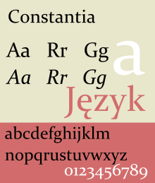
Constantia (typeface)
 | |
| Category | Serif |
|---|---|
| Designer(s) | John Hudson [1] |
| Foundry | Microsoft |
Constantia is a serif typeface designed by John Hudson and commissioned by Microsoft. It is a transitional serif design, influenced by Eric Gill's Perpetua design. Development of the typeface began in 2003 and it was released in 2006.
Constantia is part of the ClearType Font Collection, a suite of fonts from various designers released with Windows Vista. All start with the letter C to reflect that they were designed to work well with Microsoft's ClearType text rendering system, a text rendering engine designed to make text clearer to read on LCD monitors. The other fonts in the suite are Calibri, Cambria, Candara, Consolas and Corbel.
Features
Constantia was designed for either print or on-screen uses. Numerals are text figures by default, as seen on the sample image; the font also includes lining figures as an alternate style. Reviewing it for the website Typographica, Raph Levien described it as likely to be "everyone's favourite face [in the suite]...a highly readable Roman font departing only slightly from the classical model, [but] it still manages to be fresh and new. It takes some inspiration from Perpetua and Felicity...but the triangular serifs bring to mind a chisel, and the font has enough calligraphic flavor to recall Palatino."[2]
Writing in 2011, Hudson commented, "I actually don't like the name Constantia very much, and every time I see the sea birds on the dock while I'm waiting for the ferry I wish I'd thought to call it Cormorant."[3]
It is also distributed with various free Office viewers,[4][5][6] the Microsoft Office Compatibility Pack[7] and the Open XML File Format Converter for Mac.[8]
References
- ↑ "Constantia - Version 5.50". Microsoft Corp. Retrieved 23 February 2011.
- ↑ Levienon, Raph. "Microsoft’s ClearType Font Collection: A Fair and Balanced Review". Typographica. Retrieved 24 November 2014.
- ↑ Hudson, John. "Corbel discussion". Typophile forum thread. Retrieved 28 September 2014.
- ↑ Word Viewer
- ↑ Excel Viewer
- ↑ Powerpoint Viewer
- ↑ Microsoft Office Compatibility Pack for Word, Excel, and PowerPoint File Formats
- ↑ Open XML File Format Converter for Mac 1.2.1
External links
| Wikimedia Commons has media related to Constantia. |
- Van Wagener, Anne (March 4, 2005). "The Next Big Thing in Online Type". Poynter Online. Retrieved 2006-06-05.
- Microsoft ClearType Font Collection at Microsoft Typography
| ||||||||||||||||||||||||||||||||||||||||||||