ClearRx

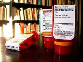
ClearRx is a trademark for a design for prescription drug packaging, designed by design student Deborah Adler as a thesis project and adopted by Target Corporation (with refinements by industrial designer Klaus Rosburg) for use in their in-store pharmacies. The design is an attempt to clarify certain difficult aspects common to most prescription bottles.
Vials have a distinctive rounded-wedge shape and are designed to stand on their caps, with the label folding over the top of the bottle, where the name of the drug is printed in large print for easy identification. A cutout on the back of the bottle includes space for a data card describing the effects and risks of the medication. Fundamental to the design is a colored rubber ring that serves as a color code so different members of a household can distinguish their individual prescriptions. An overall priority is given to distinguishability; the most important information (patient name, drug name, instructions) are placed prominently on the upper half of the label.
Liquid medicine bottles are not quite as distinctive, but feature a spill proof cap coupled with a dosing syringe that is claimed to be more accurate than spoon dispensing. The liquid medicine bottles also feature the color-coded ring around the neck.
Other innovations include revised warning symbols and labels and a small magnifying strip that can be inserted into the side of the bottle for customers with visual impairments.
The design won the prestigious "Design of the Decade" award from the Industrial Designers Society of America in 2010. [1]
References
US patent 7311205, Deborah B. Adler, Klaus Rosburg, Patrick L. Douglas, Matthew S. Grisik, "Pharmacy Bottle System Including Label", issued 2007-12-25
US patent D542661, Deborah B. Adler, Klaus Rosburg, Patrick Douglas, Matthew S. Grisik, "Bottle", issued 2007-5-15
External links
| ||||||||||||||