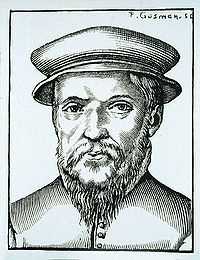
Claude Garamond
Claude Garamont (ca. 1480 – 1561), known commonly as Claude Garamond[1] was a French publisher and punch-cutter from Paris. Garamond was the first to specialize in type design and punch-cutting as a service to others.[2] As the first type designer and punch-cutter to sell his punches in retail to other printers, Garamond led on the establishment of the trend for many other typographers, punch-cutters, printers, and publishers to make the same sales in retail, which helped spread new typefaces all around.[3] He was one of the leading type designers of his time. Several contemporary typefaces, including those currently known as Garamond, Granjon, and Sabon, reflect his influence. Garamond was an apprentice of Simon de Colines; later, he was an assistant to Geoffroy Tory, whose interests in humanist typography and the ancient Greek capital letterforms, or majuscules, may have informed Garamond's later work.
Career
Garamond came to prominence in 1541, when three of his Greek typefaces (e.g. the Grecs du roi (1541)) were requested for a royally-ordered book series by Robert Estienne. Garamond's Greek font, Grecs du Roi, was used as King François I own personal font. Garamond had also published his own typefaces as well as his own new italic typeface.[4] Garamond's first roman font had been requested upon for the publication of the book "Paraphrasis in Elegantiarum Libros Laurentii Vallae" by Erasmus. Garamond's main influence for his first roman font was taken from Aldus Manutius' roman font, which gained recognition by King François I to commission Garamond for his own exclusive lettering to be created.[5] Garamond based these types on the handwriting of Angelo Vergecio, the King's Librarian at Fontainebleau, as well as that of his ten-year-old pupil, Henri Estienne. Garamond's italic fonts were influenced by the Aldine italic, which he felt complimented his roman types.[6] According to Arthur Tilley, the resulting books are "among the most finished specimens of typography that exist." Shortly thereafter, Garamond created the Roman types for which he would most be remembered, and his influence spread rapidly throughout and beyond France during the 1540s. In 1545, he entered the publishing trade in a partnership with Jean Barbé, a Parisian bookseller.[7] The first book Garamond published was called, "Pio et Religiosa Meditatio" by David Chambellan.[8]
In November of 1561, following his death, his equipment, punches, and matrices were inventoried and sold off to purchasers including Guillaume Le Bé, Christophe Plantin, and André Wechel.[9] His wife was forced to sell his punches, which caused the typefaces of Garamond to nearly disappear for two centuries. In Europe, it became the standard to use Garamond Roman typefaces at the end of the sixteenth century, and carried on its usage 200 years later.[10] It was difficult for Garamond to receive any credibility for his typefaces because there were so many who were influenced by his work. Since Garamond's work was copied often, it was hard for him to benefit financially off of his typefaces. However, Garamond was not lost due to the fact that the French National Printing Service in the 19th Century had called upon having their own typeface be a work of Claude Garamond, and here started a new revival era for Garamond's type. Unfortunately, it was a short-lived revival, but it was not only through the French National Printing Service. There were others after World War I that had recreated Garamond's fonts, such as American Type Founders, a type designer Frederic Goudy with his own recreation in 1921, Garamont, Monotype from England offered theirs in 1924, and lastly there was Linotype's entry of Granjon. Even long after there was another notable interpretation after the Second World War called Stempel Garamond by a German foundry called, Egenolff-Berner.[11] After, Paul Beaujon, an assistant librarian at the American Type Founders, visited the North Library of the British Museum and found that all of the 20th century Garamond fonts were all based on Frenchman Jean Jannon's type.[12] Garamond's typefaces left his name with greatness for having a comeback at the end of the sixteenth century throughout the seventeenth century as well.[13]
In 1621, sixty years after Garamond's death, the French printer Jean Jannon (1580–1635) created a type specimen with very similar attributes, though his letterforms were more asymmetrical, and had a slightly different slope and axis. Jannon's typefaces were lost for more than a century before their rediscovery at the National Printing Office of France in 1825, when they were wrongly attributed to Garamond. It was not until 1927, more than 100 years later, that Jannon's "Garamond" typefaces were correctly credited to him on the basis of scholarly research by Beatrice Warde. In the early 20th century, Jannon's types were used to produce a history of French printing, which brought new attention to French typography and to the "Garamond" type style. The modern revival of Claude Garamond's typography which ensued was thus inadvertently modeled on Jannon's work.[14]
Notable Types
Revivals
Along the 20th century, there are roughly five to six different interpretations or works based on the original Garamond typefaces.[15] Robert Slimbach, an Adobe senior type designer, visited the Plantin-Moretus museum in Antwerp, Belgium to study Garamond's typefaces. Slimbach enhanced and prepared his interpretations of Garamond's types in 1988. Slimbach wanted to preserve the original body of Garamond's types, but added modern subtleties to the new type, which would be Garamond Premier Pro.[16] From the Simoncini foundry of Bologna, there is Francesco Simoncini's Garamond Simoncini. Simoncini Garamond was based on a Jean Jannon typeface similar to Garamond, and works both for display and text. It is a lighter, more delicate Garamond type.[17] There is Stempel Garamond, from the German foundry, Egenolff-Berner, Monotype's Garamond produced by Fritz Max Steltzer, Garamond Monotype, Tony Stan's ITC Garamond, and Garamond Berthold by Hermann Berthold.[18] Stempel Garamond, first released by D. Stempel AG, is one of the most famous Garamond recreations. It is mostly favorable as a book typeface, specifically in Germany. Its curved bodies and sharpness set it apart from other Garamond interpretations, and many are fond of Stempel in italics for its grace.[19] Garamond Monotype, based on Jean Jannon, have different specifications on their serifs and strokes. The top serifs look like banners, and the base serifs hold a small and subtle curve with rounded terminals. The strokes' heaviest parts are carried at a 2 and 8 o' clock position. Monotype was designed especially for text composition, but is very likable in large sizes.[20] ITC Garamond, another typeface based on Jean Jannon, is created by Tony Stan. ITC Garamond is loosely based from the original Garamond's of the sixteenth century. The letters are tightly curned and have a taller x-height. In the 1970s, this was a very popular typeface for advertising in New York and was Apple's packaging and branding typeface for a long timeframe.[21]
In Popular Culture
Garamond is the name of a character in the Wii game Super Paper Mario. He appears in the world of Flopside (the mirror-image of Flipside, where the game begins). He is a prolific and highly successful author, unlike his Flipside counterpart, Helvetica (a probable recognition of the relative suitability of the two fonts for use in book typesetting).
- The large picture books of Dr. Seuss are set in a version of Garamond.
- In 1988 British newspaper The Guardian redesigned its masthead to incorporate "The" in Garamond and "Guardian" in bold Helvetica. This led to a repopularising of Garamond in the UK.
- Nvidia uses Garamond in their scientific PDF documents.[22]
- All of the American editions of J. K. Rowling’s Harry Potter books are set in twelve-point Adobe Garamond,[23][24] except Harry Potter and the Order of the Phoenix, which is set in 11.5-point Adobe Garamond because that book is longer.
- The popular Hunger Games trilogy is set in Adobe Garamond Pro, as is the Shiver trilogy by Maggie Stiefvater.
- The Everyman's Library publication of 'The Divine Comedy is set in twelve-point Garamond.
- A rare infant version—with single-story versions of the letters a and g—is available in the UK from DTP Types.
- A variation on the Garamond typeface was adopted by Apple in 1984 upon the release of the Macintosh. For branding and marketing the new Macintosh family of products, Apple's designers used the ITC Garamond Light and Book weights and digitally condensed them twenty percent. The result was not as compressed as ITC Garamond Light Condensed or ITC Garamond Book Condensed. Not being a multiple master font, stroke contrast in some characters was too light, and some of the interior counters appeared awkward. To address these problems, Apple commissioned ITC and Bitstream to develop a variant for their proprietary use that was similar in width and feeling, but addressed the digitally condensed version’s shortcomings. Designers at Bitstream produced a unique digital variant, condensed approximately twenty percent, and worked with Apple to make the face more distinct. Following this, Chuck Rowe hinted the TrueTypes. The fonts delivered to Apple were known as Apple Garamond.[25]
- One of the initial goals of the literary journal Timothy McSweeney's Quarterly Concern was to use only a single font: Garamond 3. The editor of the journal, Dave Eggers, has stated that it is his favorite font, "because it looked good in so many permutations—italics, small caps, all caps, tracked out, justified or not."[26]
- Many O’Reilly Media books are set in ITC Garamond Light.
- The logo of clothing company Abercrombie & Fitch uses a variation of the Garamond typeface.
- Garamond has thinner strokes than other common print fonts, which can reduce printing ink consumption by 25%.[27][28]
See also
- History of Western typography
- Movable type
- Printing
- Printing Press
- Punchcutting
- Typesetting
- Typography
- Garamond
References
- ↑ Bringhurst, Robert (2008). The Elements of Typographic Style. Vancouver, Canada: Hartley & Maks. p. 337. ISBN 0-88179-205-5.
- ↑ Schlager, Neil (2000). Science and Its Times: Understanding the Social Significance and Scientific Discovery. Detroit: Gale Group.
- ↑ Steinberg, S.H. (1996). Five Hundred Years of Printing. The British Library and Oak Knoll Press. pp. 16, 75.
- ↑ Schlager, Neil (2000). Science and Its Times: Understanding the Social Significance and Scientific Discovery. Detroit: Gale Group.
- ↑ Loxley, Simon (2004). Type: The Secret History of Letters. London: I.B. Tauris.
- ↑ "French/Garamond". Spokane Falls Community College. Retrieved 6 November 2013.
- ↑ Garamond French Ministry of Culture and Communication.
- ↑ "Claude Garamond". Linotype. Retrieved 5 November 2013.
- ↑ Garamond French Ministry of Culture and Communication.
- ↑ Tselentis, Jason (2012). Typography, Referenced: A Comprehensive Visual Guide to the Language, History, and Practice of Typography. Gloucester, Mass: Rockport Publishers. p. 74.
- ↑ "Just What Makes a Garamond a Garamond?". Linotype. Retrieved 6 November 2013.
- ↑ Loxley, Simon (2004). Type: The Secret History of Letters. London: I.B. Tauris.
- ↑ Steinberg, S.H. (1996). Five Hundred Years of Printing. The British Library and Oak Knoll Press. pp. 16, 75.
- ↑ Linotype: "What Makes a "Garamond" a Garamond?"
- ↑ Garbor, Peter. "Garamond v Garamond: Physiology of a Typeface". Le Monde. Retrieved 6 November 2013.
- ↑ "Garamond Premier Pro". Adobe. Retrieved 5 November 2013.
- ↑ "About Simoncini Garamond Font Family". Linotype. Retrieved 19 November 2013.
- ↑ Garbor, Peter. "Garamond v Garamond: Physiology of a Typeface". Le Monde. Retrieved 6 November 2013.
- ↑ "Just What Makes a Garamond a Garamond?". Linotype. Retrieved 20 November 2013.
- ↑ "Just What Makes a Garamond a Garamond?". Linotype. Retrieved 20 November 2013.
- ↑ "Just What Makes a Garamond a Garamond?". Linotype. Retrieved 20 November 2013.
- ↑ "NVIDIA OpenCL JumpStart Guide". NVIDIA. Retrieved 9 December 2013.
- ↑ Harry Potter and the Order of the Phoenix, back pages
- ↑ "Adobe Garamond in the Harry Potter books — not a character but a font". Retrieved 9 December 2013.
- ↑ "ITC Garamond Font Family". MyFonts.com. Retrieved 9 December 2013.
- ↑ Eggers, Dave. The Best of McSweeney's - Volume 1. ISBN 0-241-14234-2.
- ↑ Stix, Madeline. "Teen to Government; chane your typeface, save millions". CNN.com. Retrieved 29 March 2014.
- ↑ Agarwal, Amit (19 July 2012). "Which Fonts Should You Use for Saving Printer Ink". Digital Inspiration. Retrieved 29 March 2014.
Sources
- Tilley, Arthur (1900). "Humanism under Francis I". The English Historical Review 15 (59): 456–478. doi:10.1093/ehr/xv.lix.456.
- Lane, John A. (August 2005). "Claude Garamont and his Roman Type". In Adobe Systems (ed.). Garamond Premier Pro: A Contemporary Adaptation. Adobe Systems. pp. 5–13. A survey of Claude Garamond's careerasd and typefaces, of Robert Granjon's italic types which were combined with Garamond roman types, and a brief summary of subsequent revivals through Garamond Premier Pro.
- Kapr, Albert (1983). Schriftkunst. Geschichte, Anatomie und Schönheit der lateinischen Buchstaben (in German). Munich.