Bootstrap (front-end framework)
 | |
| Stable release | 3.3.4 / March 16, 2015[1] |
|---|---|
| Written in | HTML, CSS, LESS, Sass and JavaScript |
| Platform | Web engines |
| Type | HTML and CSS-based design templates |
| License | MIT License (Apache License 2.0 prior to 3.1.0) |
| Website |
getbootstrap |
Bootstrap is a free and open-source collection of tools for creating websites and web applications. It contains HTML- and CSS-based design templates for typography, forms, buttons, navigation and other interface components, as well as optional JavaScript extensions. The bootstrap framework aims to ease web development.
Bootstrap is a front end, that is an interface between the user and the server-side code which resides on the "back end" or server. And it is a web application framework, that is a software framework which is designed to support the development of dynamic websites and web applications.
As of March 2015, it was the most-starred project on GitHub, with over 78,000 stars and more than 30,000 forks.[2]
Origin
Bootstrap, originally named Twitter Blueprint, was developed by Mark Otto and Jacob Thornton at Twitter as a framework to encourage consistency across internal tools. Before Bootstrap, various libraries were used for interface development, which led to inconsistencies and a high maintenance burden. According to Twitter developer Mark Otto:
"A super small group of developers and I got together to design and build a new internal tool and saw an opportunity to do something more. Through that process, we saw ourselves build something much more substantial than another internal tool. Months later, we ended up with an early version of Bootstrap as a way to document and share common design patterns and assets within the company."[3]
After a few months of development by a small group, many developers at Twitter began to contribute to the project as a part of Hack Week, a hackathon-style week for the Twitter's development team. It was renamed from Twitter Blueprint to Bootstrap, and released as an open source project on August 19, 2011.[4] It has continued to be maintained by Mark Otto, Jacob Thornton, and a small group of core developers, as well as a large community of contributors.[5]
On January 31, 2012, Bootstrap 2 was announced. This release added the twelve-column grid layout and responsive design components, as well as changes to many of the existing components.[6] The Bootstrap 3 release was announced on 19 August, 2013, moving to a mobile first approach and using a flat design.[7]
Features
Bootstrap is compatible with the latest versions of the Google Chrome, Firefox, Internet Explorer, Opera, and Safari browsers, although some of these browsers are not supported on all platforms.[8]
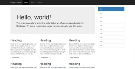
Since version 2.0 it also supports responsive web design. This means the layout of web pages adjusts dynamically, taking into account the characteristics of the device used (desktop, tablet, mobile phone).
Starting with version 3.0, Bootstrap adopted a mobile first design philosophy, emphasizing responsive design by default.
Bootstrap is open source and available on GitHub. Developers are encouraged to participate in the project and make their own contributions to the platform.
Structure and function
Bootstrap is modular and consists essentially of a series of LESS stylesheets that implement the various components of the toolkit. A stylesheet called bootstrap.less includes the components stylesheets. Developers can adapt the Bootstrap file itself, selecting the components they wish to use in their project.
Adjustments are possible to a limited extent through a central configuration stylesheet. More profound changes are possible by the LESS declarations.
The use of LESS stylesheet language allows the use of variables, functions and operators, nested selectors, as well as so-called mixins.
Since version 2.0, the configuration of Bootstrap also has a special "Customize" option in the documentation. Moreover, the developer chooses on a form the desired components and adjusts, if necessary, the values of various options to their needs. The subsequently generated package already includes the pre-built CSS style sheet.
Grid system and responsive design comes standard with a 1170 pixel wide, grid layout. Alternatively, the developer can use a variable-width layout. For both cases, the toolkit has four variations to make use of different resolutions and types of devices: mobile phones, portrait and landscape, tablets and PCs with low and high resolution. Each variation adjusts the width of the columns.
The CSS
Bootstrap provides a set of stylesheets that provide basic style definitions for all key HTML components. These provide a uniform, modern appearance for formatting text, tables and form elements.[9]
Re-usable components
In addition to the regular HTML elements, Bootstrap contains other commonly used interface elements. These include buttons with advanced features (e.g. grouping of buttons or buttons with drop-down option, make and navigation lists, horizontal and vertical tabs, navigation, breadcrumb navigation, pagination, etc.), labels, advanced typographic capabilities, thumbnails, warning messages and a progress bar. The components are implemented as CSS classes, which must be applied to certain HTML elements in a page.
JavaScript components
Bootstrap comes with several JavaScript components in the form of jQuery plugins. They provide additional user interface elements such as dialog boxes, tooltips, and carousels. They also extend the functionality of some existing interface elements, including for example an auto-complete function for input fields. In version 2.0, the following JavaScript plugins are supported: Modal, Dropdown, Scrollspy, Tab, Tooltip, Popover, Alert, Button, Collapse, Carousel and Typeahead.
See also
References
- ↑ "Bootstrap 3.3.4 Released". http://blog.getbootstrap.com/2015/03/16/bootstrap-3-3-4-released/''.
- ↑ "Search · stars:>1". GitHub. Retrieved 5 March 2015.
- ↑ Otto, Mark (17 January 2012). "Bootstrap in A List Apart No. 342". Mark Otto.
- ↑ Otto, Mark (19 August 2011). "Bootstrap from Twitter". Developer Blog. Twitter.
- ↑ "About". Bootstrap.
- ↑ Otto, Mark (31 January 2012). "Say hello to Bootstrap 2.0". Developer Blog. Twitter.
- ↑ "Bootstrap 3 released". The Official Bootstrap Blog. 19 August 2013.
- ↑ "Supported browsers". Bootstrap.
- ↑ http://blog.seosemanticxhtml.com/a-complete-reference-library-of-bootstrap-classes/
External links
 |
Wikimedia Commons has media related to Bootstrap (framework). |
- Bootstrap - The official website, contains documentation and downloads
- Bootstrap Blog - The official Bootstrap blog maintained by the developer, Mark Otto