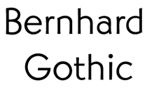
Bernhard Gothic
 | |
| Category | Sans-serif |
|---|---|
| Classification | Geometric |
| Designer(s) | Lucian Bernhard |
| Foundry | American Type Founders |
| Date released | 1929 - 30 |
| Re-issuing foundries | Intertype |
| Design based on | Futura, Kabel |
| Also known as | Greeting Gothic |
 | |
| Sample | |
Bernhard Gothic is a family of geometric sans serif typeface designed by Lucian Bernhard in 1929 for the American Type Founders (ATF). Five variations by Bernhard were introduced over two years:
- Bernhard Gothic Light (1929)
- Bernhard Gothic Medium (1929)
- Bernhard Gothic Light Italic (1930)
- Bernhard Gothic Heavy (1930)
- Bernhard Gothic Extra Heavy (1930)
A final member of the family, Bernhard Gothic Medium Condensed, was introduced by ATF in 1936, but it is unclear as to who the designer was.[1]
Bernhard Gothic is more organic and less regular than other geometric sans-serif typefaces, including Futura, Kabel, and Twentieth Century, showing influence of Bernhard's earlier more expressionistic faces.
Hot Metal Copies
Intertype's 1936 copy was called Greeting Gothic.[2]
Digital Copies
Digital copies are available from Elsner+Flake, Font Company, URW++, Berthold, Spiece Graphics, Monotype Imaging and FontHaus.