BBC Four idents
BBC Four and its predecessor BBC Knowledge are both channels operated by the BBC as cultural and knowledge based channels. Their visual identities therefore have been a result of this aim.
BBC Knowledge
Ladders of Learning

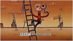
BBC Knowledge was launched in 1999 with the intent of creating a multimedia learning channel.[1] The idea was that computers, interactive TV via the Red Button and television could come together to make a new, factual, learning channel for kids and adults alike.[1] The launch identity consisted of cartoon characters climbing 'ladders of learning' between clouds against an orange background.[1][2] All the idents featured the station logo, which followed the BBC style design of the time by having the station name follow the BBC logo in upper case. This white logo would appear at the end of ident.[1][2]
The idents all featured characters, drawn by Michael Sheehy,[1] shown with items such as a magnifying glass, telescope or rolls of paper.[1] Several variations of the ident were made featuring different characters prominent on the ladders of learning.[1] The ident was also used as the background to programme menus with characters seen climbing the ladders of learning in the background with programme information overlaid and centred to accommodate widescreen.[1] These characters could also been seen as stills on launch promotional material and on the BBC Knowledge website.[1][2]
The channel launched with a Digital on-screen graphic (DOG), in line with the BBC practice at the time. However, different from the other channels which used the station logo, BBC Knowledge used the URL of their website 'www.bbc.co.uk/knowledge'.[1][2][3] The use of this promoted the website tie in with the channel. The channel also used credit promotions where additional content or information is promoted over a programmes end credits, by reducing the credits to a smaller size and filling the information in the remaining space.[1][3] Another style of presentation utilised was that of viewer videos, shown either as part of the shrinking credits, or between programmes.[1][3]
The presentation for the channel as a whole was in 16:9 Widescreen from launch, however all information was kept in a 4:3 safe area so no information was lost to viewers watching on a 'full screen' television. Information included the logo, promotions and the DOG.[1][3]
Circles
Following the approval of the new BBC Four, BBC Knowledge programming was realigned to better reflect the new channel. A single ident was utilised instead featuring a circle made out of different materials which would move forward and off the screen at the viewer.[4] These could be made with a variety of objects.[4] The musical accompanyment followed the choral and instrumental style.[4] This sequence lasted until the station went off air. Promotional style remained the same with the BBC Knowledge logo seen at the bottom. The DOG also changed to the BBC Knowledge logo.
Stranded idents
The channel had always utilised a stranded layout to make genres of programmes easy to find on the new channel. However, special idents began to appear for each strand from c.2000.[2][3] These featured an object, before a fact about it related to the strand appears and ends on an image with the strand name shown clearly on screen, with a letter encircled at the centre of the screen.[2] It is unclear whether these idents were replacements of the normal idents, or complimentory to them, however it appears they complemented them, with these idents being used in the stranded sections, with the animated idents used for general interest programming.
Following the relaunch in 2001, all different idents were dropped in favour of a single ident, featuring numerous circles made out of different structures reflecting the new strands.
BBC Four
Improvised

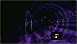
The BBC's "cultural" channel BBC Four was launched on 2 March 2002 as a successor to BBC Knowledge. As a result, the channel was to show a broad variety of programming. To show this, Lambie Nairn devised the idea of an improvised ident that reacted to the frequencies of continuity announcers' voices or the background music of the ident.[5] As a result no idents were ever the same, however variations were produced featuring different visualisations, such as semi circles, vibrating lines or shafts extending from the bottom surface.[5]
The channel logo featured the new style of logo with the channel name 'Four' located in upper case inside a black bow with the BBC logo above it. This logo was present in the bottom right corner of idents and promotions for the entire duration.[5]
The launch slogan of the channel 'Everybody needs a place to think' was present on all launch promotions.[5] Promotional style featured the BBC Four logo present throughout the promotion with the details appearing in white in the top right corner of the screen, aligned right.[5] If the background image was too light, a translucent black box was placed over the top third of the screen. The channel also used a DOG, however this was not the new logo, but a one line style used by the previous channel with the BBC logo and 'FOUR' to the right of it in the same size.[5]
Four sections

BBC Four's identity changed on 10 September 2005. These new idents, designed by Red Bee Media, featured an image made up of four parts but undistinguishable until something interacts within the scene.[5][6] Idents included:
- Seagulls which fly between the pictures, often getting closer or further away than previous.[5][6][7]
- A girl climbs a ladder against a bookcase. As the ladder is moved, the ladder section in a different segment moves differently. Equally the girl may climb off the bottom of the screen to reappear at the top. In addition, whenever she replaced a book, another fell out in a different segment.[5][6][7]
- A mountain scene against a lake where a drop of water causes ripples in more than one segment, before a drop rises from the sky/lake in another segment.[6][7]
- A child in a swimming pool swimming with a ring. The views are from different angles, for example looking down from the air and underwater looking up at the surface.[5][6][7]
- Bees collecting nectar that appear elsewhere when flying across borders.[5][6][7]
The black box logo was retained from the previous look but moved to the centre of the screen to divide the four segments.[5][6][7] Promotional style also changed. The BBC Four logo would remain in the bottom corner of the screen throughout the promotion, but would be overlaid by the programme information in an opaque coloured box in the lower right segment of the screen, with the BBC Four logo in the centre.[5][8] This was altered in 2008 to a BBC Four box appears in the middle of the screen from which the video is wiped out anticlockwise round the logo from the right revealing the programme information to the right of the logo.[8]
The DOG for the channel remained the same in the 4:3 screen size safe zone;[5] this was only changed in 2011 when it was switched to widescreen 16:9.
See also
References
- ↑ 1.0 1.1 1.2 1.3 1.4 1.5 1.6 1.7 1.8 1.9 1.10 1.11 1.12 Walker, Hayden. "BBC Knowledge". TVARK: The Online Television Museum. Retrieved 13 December 2011.
- ↑ 2.0 2.1 2.2 2.3 2.4 2.5 "BBC KnowledgeJune 1999 - December 2000 Idents". The TV Room. Retrieved 13 December 2011.
- ↑ 3.0 3.1 3.2 3.3 3.4 "BBC Knowledge June 1999 - December 2000 Miscellaneous". The TV Room. Retrieved 13 December 2011.
- ↑ 4.0 4.1 4.2 "BBC Knowledge December 2000 - March 2002". The TV Room. Retrieved 13 December 2011.
- ↑ 5.0 5.1 5.2 5.3 5.4 5.5 5.6 5.7 5.8 5.9 5.10 5.11 5.12 5.13 "BBC Four Idents". TVARK. Retrieved 31 July 2011. Contains videos of the idents.
- ↑ 6.0 6.1 6.2 6.3 6.4 6.5 6.6 "BBC Four - Idents". BBC. Retrieved 13 December 2011.
- ↑ 7.0 7.1 7.2 7.3 7.4 7.5 "BBC Four September 2005 - Present". The TV Room. Retrieved 13 December 2011.
- ↑ 8.0 8.1 "BBC Four September 2005 - Present Promotions 1". The TV Room. Retrieved 13 December 2011.
External links
- BBC Four at BBC Online
- BBC Knowledge Homepage Archived
- TVARK: The Online Television Museum - BBC Four
- The TV Room
| |||||||||||||||||||||||||||||||||||||||||||||
| ||||||||||||||||||||||||||||||
| ||||||||||||||||||||||