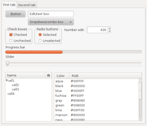
GUI widget


In computer programming, a GUI widget (or control) is an element of a graphical user interface (GUI) that displays an information arrangement changeable by the user, such as a window or a text box. The defining characteristic of a widget is to provide a single interaction point for the direct manipulation of a given kind of data. In other words, widgets are basic visual building blocks which, combined in an application, hold all the data processed by the application and the available interactions on this data.
History and use
A family of common reusable widgets has evolved for holding general information based on the Palo Alto Research Center Inc. research for the Xerox Alto User Interface. Various implementations of these generic widgets are often packaged together in widget toolkits, which programmers use to build graphical user interfaces (GUIs). Most operating systems include a set of ready-to-tailor widgets that a programmer can incorporate in an application, specifying how it is to behave. Each type of widget generally is defined as a class by object-oriented programming (OOP). Therefore, many widgets are derived from class inheritance.
In the context of an application, a widget may be enabled or disabled at a given point in time. An enabled widget has the capacity to respond to events, such as keystrokes or mouse actions. A widget that cannot respond to such events is considered disabled. The appearance of disabled widget is typically different from an enabled widget; the disabled widget may be drawn in a lighter color, or may be visually obscured in some way. See the image to the right for an example.
Widgets are sometimes qualified as virtual to distinguish them from their physical counterparts, e.g. virtual buttons that can be clicked with a pointer, vs. physical buttons that can be pressed with a finger.
A related (but different) concept is the desktop widget, a small specialized GUI application that provides some visual information and/or easy access to frequently used functions such as clocks, calendars, news aggregators, calculators and desktop notes. These kinds of widgets are hosted by a widget engine.
Etymology
“Widget” entered American English around 1920 as a generic term for any useful device, particularly a product manufactured for sale. In computer use it has been borrowed as a shortened form of “window gadget,” and was first applied to user interface elements during Project Athena in 1988. The word was chosen because "all other common terms were overloaded with inappropriate connotations" – since the project's Intrinsics toolkit associated each widget with a window of the underlying X Window System – and because of the common prefix with the word window.[1]
List of common generic widgets
- Selection and display of collections
- Button – control which can be clicked upon to perform an action
- Check box – control which can be clicked upon to select or deselect an option. Multiple check boxes in a group may be selected
- Radio button – control which can be clicked upon to select an option from a selection of options from which only one can be selected at a time. Thus radio buttons always appear in pairs or larger groups
- Split button – control combining a button (typically invoking some default action) and a drop-down list with related, secondary actions
- Slider – control with a handle that can be moved up and down (vertical slider) or right and left (horizontal slider) to select a value (or a range if two handles are present)
- List box
- Spinner – value input control which has small up and down buttons to step through a range of values
- Drop-down list
- Menu – control with multiple actions which can be clicked upon to choose a selection to activate
- Context menu – a type of menu whose contents depend on the context or state in effect when the menu is invoked
- Pie menu
- Ribbon
- Menu bar
- Toolbar
- Combo box (text box with attached menu or List box)
- Icon
- Tree view
- Grid view
- Button – control which can be clicked upon to perform an action
- Navigation
- Text/value input
- Output
- Label – text used to describe another widget
- Tooltip – informational window which appears when the mouse hovers over another control
- Balloon help
- Status bar
- Progress bar
- Infobar
- Containers
- Window
- Collapsible panel
- Accordion (GUI)
- Modal window
- Dialog box
- Palette window, also known as "Utility window"
- Frame
- Window
See also
- Graphical user interface elements
- Metawidgets are widgets for controlling the operation of other widgets within a GUI.
- Widget engine for mostly unrelated, physically inspired "widgets"
- Widget toolkit for the implementations of widget programming interfaces
References
- ↑ Ralph R. Swick, Mark S. Ackerman (1988). "The X Toolkit: More Bricks for Building User-Interfaces, or, Widgets for Hire". USENIX Winter. pp. 221–228. Retrieved 2007-01-03.
External links
| |||||||||||||||||||||||
| |||||||||||||||||||||||||||||||||||||||||||||||||||||||||||||||||||||||||||||||