Bembo
 | |
| Category | Serif |
|---|---|
| Classification | Old style |
| Designer(s) | Stanley Morison |
| Foundry | Monotype |
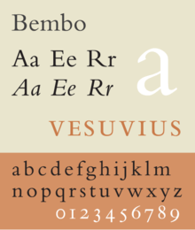
Bembo is the name given to a 20th-century revival of an old style serif or humanist typeface cut by Francesco Griffo around 1495.
The typeface Bembo seen today is a revival designed under the direction of Stanley Morison for the Monotype Corporation in 1929.
It is considered a good choice for expressing classic beauty or formal tradition in typographical design and is generally held to be a good book face.
Distinctive Visual Identifiable Characteristics
Characteristics of this typeface are the following:
lower case: double-story a.
upper case: the capital Q's tail is centered under the figure, the uppercase J has a slight hook, and there are two versions of uppercase R, one with a straight tail and one with a curved tail.[citation needed]
Bembo is a classic typeface that displays the characteristics that identify Old Style, humanist designs:
- minimal variation in thick and thin stroke weight
- small x-height
- ascender height exceeding cap height
- oblique stress
- short, bracketed serifs with cupped bases
- angled top serifs on lower case letters
History

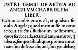
Griffo cut punches for the Venetian press of the humanist printer Aldus Manutius. The face was first used in February 1496 (1495 more veneto), in the setting of a book entitled Petri Bembi de Aetna Angelum Chabrielem liber, a 60-page text about a journey to Mount Aetna written by the young Italian humanist poet Pietro Bembo, later a Cardinal and secretary to Pope Leo X.
Six years later Griffo was responsible for the first italic types, cut for Aldus.
A second version of the roman face followed in 1499 and this type was used to print the famous illustrated Hypnerotomachia Poliphili. This typeface served as a source of inspiration for typefaces of the Parisian typefounder Claude Garamond, for Voskens and many others, which were themselves the sources for Caslon types and many other European types of the sixteenth and seventeenth centuries.[1]
Griffo was the first punch-cutter to fully express the character of the humanist hand that contemporaries preferred for manuscripts of classics and literary texts, in distinction to the book hand humanists dismissed as a gothic hand or the everyday chancery hand. The typeface called Bembo has a calligraphic feel that is particularly evident in the serifs. It has a delicate transitional curve that rises up into the stem of each letter. Many lowercase letters exhibit hints of sinuous curves reminiscent of those generated by hand-drawn letters; the termination of the arm of both the r and the e flare slightly upward and outward. The lowercase c has a subtle forward slant, a reversal of the oblique stress of the o. Characters h, m, and n have a slight returned curve on their final stem. Lowercase italic k has an elegantly curved stroke in the lower-right. One of the main characteristic that distinguished Griffo's types from earlier Venetian forms is the way in which the ascenders of the lowercase letters stand taller than the capitals. An infant variety also exists, which contains single-story versions of the letters A and G.
According to the authors of Typographic Specimens: The Great Typefaces, Bembo is noted for its ability to "provide a text that is extremely consistent in color and texture," helping it to "remain one of the most popular book types since its release."
Monotype history
Monotype Bembo is generally regarded as one of the most handsome revivals of Aldus Manutius’s 15th-century roman type. However there is no italic cut with it. The rumor goes that Stanley Morison commissioned Alfred Fairbank (Born: Grimsby, United Kingdom, 1895, Died: Hove, Sussex, 1982), a renowned calligrapher, to design an italic for Bembo. This was released in metal type in 1929, but Fairbank claimed that he made the design independently and sold the drawings to Monotype.
Fairbank’s design—although very beautiful—was, however, not used at first with the Bembo roman. A more conventional italic was cut by Monotype and used to complete to the Bembo font-family.
Fairbank’s first design, which was based on the work of 16th-century writing master Ludovico degli Arrighi, was, however, made available in 4 sizes, named Bembo Condensed Italic.
Recently available fonts
More recently, Bembo is the typeface used for volumes in the Everyman's Library series. It is also the principal typeface in the Rough Guides series of travel books.
Two recent font development projects based on the De Aetna face (and the italic created by Monotype to go with it) are Cardo and Yale. The Cardo fonts, developed by David J. Perry for use in classical scholarship and also including Greek and Hebrew, are freely available under the SIL Open Font License.[2] The Yale face, developed by Matthew Carter, is available exclusively to "Yale students, employees, and authorized contractors for use in Yale publications and communications. It may not be used for personal or business purposes, and it may not be distributed to non-Yale personnel."[3]
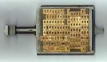
Available matrices


- 270: Bembo roman/italic
- composition-matrices UA.91: 6D - 14pt [4]
- variants: long and short descenders
| corps: | 6pt (6D) | 7pt (7D) | 8pt (8D) | 9pt (8D) | 10pt (10D) | 10.5pt (9D) | 11pt (10D) | 12pt (11D) | 13pt (12D) |
14pt (14D) |
| set: | 6.75 | 7.5 | 7.5 | 8.25 | 8.5 | 9 | 9.5 | 10.25 | 11 | 11.5 |
| line: | M.1237 | M.1243 | M.1243 | M.1270 | M.1292 | M.1312 | M.1322 | M.1343 | M.1378 | M.1444 |
- large composition matrices: 14pt-24pt
| corps: | 14pt (14D) | 16pt (16D) | 18pt (18D) | 24pt (24D) |
| UA. | 91 | 163 | 169 | 169 |
| set: | 11.5 | 13.5 | 14.5 | 19.5 |
| line: | T.1344 | T.1559 | T.1725 | T.2302 |
- display-matrices:
| corps: | 14pt | 16pt | 18pt | 22pt op 24pt | 24pt | 30pt | 36pt | 48pt | 60pt | 72pt |
| line: | T.1344 | T.1559 | T.1725 | T.2104 | T.2302 | T.2824 | T.3444 | T.4648 | T.5821 | T.6980 |
- 428: Bembo bold romein/cursief
- composition-matrices: UA.368: 6D - 14pt [5]
| corps: | 6pt (6D) | 7D op 8p E | 8pt (8D) | 9pt (8D) | 10pt (10D) | 10.5pt (10D) | 11pt (10D) | 12pt (11D) | 13pt (12D) | 14pt (14D) |
| set: | 6.75 | 7.5 | 7.5 | 8.25 | 8.5 | 9 | 9.5 | 10.25 | 11 | 11.5 |
| line: | M.1237 | M.1243 | M.1243 | M.1270 | M.1293 | M.1312 | M.1322 | M.1353 | M.1378 | M.1444 |
- groot-zetselmatrijzen: 14pt-18pt
| corps: | 16pt (16D) | 18pt (18D) |
| UA. | 399 | 399 |
| set: | 13.5 | 14.5 |
| line: | T.1559 | T.1725 |
- display-matrices:
| corps: | 24pt | 30pt | 36pt | 48pt |
| line: | T.2302 | T.2824 | T.3444 | T.4648 |
- 294: Bembo condensed Italic cursief
- composition-matrices: UA.360: 4 sizes: 10pt - 16pt UA.361: 16pt [6]
| corps: | 10pt (10D) | 12pt (12D) | 13pt (12D) | 16pt |
| set: | 8.5 | 10.25 | 11 | 13.5 |
| line: | M.1292 | M.1353 | M.1378 | M.1559 |
- 428: Bembo Heavy (zie: 428 Bembo Bold)
- 509: Bembo semi-bold romein/cursief
- composition-matrices: UA.91: 5.5pt [7]
| corps: | 5.5pt (5.5D) |
| set: | 6.5 |
| line: | M.1235 |
- 370: Bembo titling romein/cursief
- display-matrices:[7]
| corps: | 24pt | 30pt | 36pt | 42pt |
| line: | T.2942 | T.3614 | T.4436 | T.5196 |
See also
- Antiqua
- History of western typography
- Typography
Notes
- ↑ The Monotype Corporation limited, specimen blade 5-64, Bembo 270
- ↑ Perry, David (April 20, 2011). "The Cardo Font". Retrieved July 2, 2013.
- ↑ "Introducing the Yale Typeface: Font Download". Yale University. Retrieved July 2, 2013.
- ↑ The Monotype corporation ltd, 3-46 en 3-71
- ↑ The Monotype corporation ltd, 8-59
- ↑ The Monotype corporation ltd, 5-51
- ↑ 7.0 7.1 The Monotype corporation ltd, 5-76
References
- Lawson, Alexander S., Anatomy of a Typeface. Godine: 1990. ISBN 978-0-87923-333-4.
- Meggs, Philip B. and Rob Carter.Typographic Specimens: The Great Typefaces. John Wiley & Sons, Inc.: 1993. ISBN 0-471-28429-7
- Meggs, Philip B. and McKelvey, Roy.Revival of the Fittest: Digital Versions of Classic Typefaces. RC Publications: 2000. ISBN 1-883915-08-2
- Meggs, Philip B. History of Graphic Design. John Wiley & Sons, Inc.: 1998. ISBN 0-470-04265-6