Traffic sign
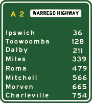

Most countries post signage, known as traffic signs or road signs, at the side of roads to impart information to road users. Because language differences can create barriers to understanding, international signs using symbols in place of words have been developed in Europe and adopted in most countries of the world.
Contents |
Definitions
Anexe 1 of the Vienna Convention on Road Signs and Signals of November 8, 1968 defines eight categories of signs:
- A. Danger warning signs
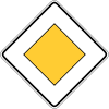
- B. Priority signs
- C. Prohibitory or restrictive signs
- D. Mandatory signs
- E. Special regulation signs
- F. Information, facilities, or service signs
- G. Direction, position, or indication signs
- H. Additional panels
However, countries and areas categorise road signs in different ways. In the U.S., the type, placement, and graphic standards of traffic signs and pavement markings are legally defined — the Federal Highway Administration's Manual on Uniform Traffic Control Devices is the standard.
A rather informal distinction among the directional signs is the one between advance directional signs, interchange directional signs, and reassurance signs. Advance directional signs appear at a certain distance from the interchange, giving information for each direction. A number of countries do not give information for the road ahead (so-called "pull-through" signs), and only for the directions left and right. Advance directional signs enable drivers to take precautions for the exit (e.g., switch lanes, double check whether this is the correct exit, slow down). They often do not appear on lesser roads, but are normally posted on expressways and motorways, as drivers would be missing exits without them. While each nation has its own system, the first approach sign for a motorway exit is mostly placed at least 1000 m from the actual interchange. After that sign, one or two additional advance directional signs typically follow before the actual interchange itself.
History
The earliest road signs were milestones, giving distance or direction; for example, the Romans erected stone columns throughout their empire giving the distance to Rome. In the Middle Ages, multidirectional signs at intersections became common, giving directions to cities and towns.
Traffic signs became more important with the development of automobiles. One of the first modern-day road sign systems was devised by the Italian Touring Club in 1895. By 1900, a Congress of the International League of Touring Organizations in Paris was considering proposals for standardization of road signage. The basic patterns of most traffic signs were set at the 1908 International Road Congress in Rome. In 1909, nine European governments agreed on the use of four pictorial symbols, indicating "bump", "curve", "intersection", and "grade-level railroad crossing". The intensive work on international road signs that took place between 1926 and 1949 eventually led to the development of the European road sign system. The United States developed its own road signage system, which was also adopted by several other nations. Beginning in the 1960s, North American signage began adopting international symbols and signs into its system.
Over the years, change was gradual. Today, signs are almost all metal, rather than wood, and are coated with retroreflective sheetings of various types for nighttime and low-light visibility.
New generations of traffic signs based on big electronic displays can also change their symbols and provide intelligent behavior by means of sensors or by remote control. These "road beacon systems" are based on the use of RFID transponders buried in the asphalt to allow for on-board signalling and interaction between the car and the road.
Yet another "medium" for transferring information ordinarily associated with visible signs is RIAS (Remote Infrared Audible Signage), e.g., "talking signs" for print-handicapped (including blind/low-vision/illiterate) people. These are infra-red transmitters serving the same purpose as the usual graphic signs when received by an appropriate device such as a hand-held receiver or one built into a cell phone.
North America and Australia

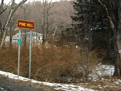
Categorization
- Regulatory signs
- Warning signs
- Guide signs
- Street signs
- Route marker signs
- Expressway signs
- Freeway signs
- Welcome Signs
- Informational signs
- Recreation and cultural interest signs
- Emergency management (civil defense) signs
- Temporary traffic control (construction or work zone) signs
- School signs
- Railroad and light rail signs
- Bicycle signs
Color schemes
The North American, Australian and New Zealand colours normally have these meanings:
- red with white for stop signs, yield, and forbidden actions (such as No Parking)
- green with white letters for informational signs, such as directions, distances, and places
- brown with white for signs to parks, historic sites, ski areas, forests, and campgrounds
- blue with white for rest areas, food, gasoline or petrol, hospitals, lodging, and other services
- black with white for commercial, exempt, special, and signs were used in the past
- white with black (or red letters) for regulatory signs, such as speed limits (or parking)
- yellow with black letters and symbols for warning signs, such as curves and school zones
- orange with black letters for temporary traffic control zones and detours associated with road construction
Regulatory signs are also sometimes seen with white letters on red or black signs. In Quebec, blue is often used for tourist attractions and brown public services such as rest areas; many black-on-yellow signs are red-on-white instead. Many U.S. states and Canadian provinces now use fluorescent orange for construction signs, and fluorescent yellow-green for school zone, crosswalk, pedestrian, and bicycle warning signs. Fluorescent pink signs are sometimes used for incident management warning.
Highway symbols and markers
Every state and province has different markers for its own highways, but use standard ones for all federal highways. Many special highways– such as the Queen Elizabeth Way, Trans-Canada Highway, and the Dixie Highway in the U.S. – have used unique signs. Counties in the U.S. sometimes use a pentagon-shaped blue sign with yellow letters for numbered county roads, though the use is inconsistent even within states.
Units
Most U.S. road signs measure distances in miles rather than kilometers although the federal Department of Transportation has developed metric standards for all signs. United Kingdom signs also display distances in miles. Elsewhere, distances are generally in metric.
Languages
Signs in most of Canada, the U.S., Australia, and New Zealand are written in English. Quebec uses French, while New Brunswick uses both English and French, and a number of other provinces, such as Ontario and Manitoba, use bilingual French–English signs in certain localities. Mexico uses Spanish. Within a few miles of the U.S.-Mexico border, road signs are often in English and Spanish; indigenous languages, mainly Nahuatl as well as some Mayan languages, have been used as well.
Typefaces
The typefaces predominantly used on signs in the U.S. and Canada are the FHWA alphabet series (Series B through Series F and Series E Modified). Details of letter shape and spacing for these alphabet series are given in "Standard Alphabets for Traffic Control Devices," first published by the Bureau of Public Roads (BPR) in 1945 and subsequently updated by the Federal Highway Administration (FHWA). It is now part of Standard Highway Signs (SHS), the companion volume to the MUTCD which gives full design details for signfaces.
Initially, all of the alphabet series consisted of uppercase letters and digits only, although lowercase extensions were provided for each alphabet series in a 2002 revision of SHS. Series B through Series F evolved from identically named alphabet series which were introduced in 1927.
Straight-stroke letters in the 1927 series were substantially similar to their modern equivalents, but unrounded glyphs were used for letters such as B, C, D, etc., to permit more uniform fabrication of signs by illiterate painters. Various state highway departments and the federal BPR experimented with rounded versions of these letters in the following two decades.
The modern, rounded alphabet series were finally standardised in 1945 after rounded versions of some letters (with widths loosely appropriate for Series C or D) were specified as an option in the 1935 MUTCD and draft versions of the new typefaces had been used in 1942 for guide signs on the newly constructed Pentagon road network.
The mixed-case alphabet now called Series E Modified, which is the standard for destination legend on freeway guide signs, originally existed in two parts: an all-uppercase Series E Modified, which was essentially similar to Series E except for a larger stroke width, and a lowercase-only alphabet. Both parts were developed by the California Division of Highways (now Caltrans) for use on freeways in 1948–1950.
Initially the Division used all-uppercase Series E Modified for button-reflectorized letters on ground-mounted signs and mixed-case legend (lowercase letters with Series D capitals) for externally illuminated overhead guide signs. Several Eastern turnpike authorities blended all-uppercase Series E Modified with the lowercase alphabet for destination legends on their guide signs.
Eventually this combination was accepted for destination legend in the first manual for signing Interstate highways, which was published in 1958 by the American Association of State Highway Officials and adopted as the national standard by the BPR.
Uses of Non-FHWA Typefaces

The U.S. National Park Service uses NPS Rawlinson Roadway, a serif typeface, for guide signage; it typically appears on a brown background. Rawlinson has replaced Clarendon as the official NPS typeface, but some states still use Clarendon for recreational signage.
Georgia, in the past, used uppercase Series D with a custom lowercase alphabet on its freeway guide signs; the most distinctive feature of this typeface is the lack of a dot on lowercase i and j.[1] More recent installations appear to include the dots.[2]
The Clearview typeface, developed by U.S. researchers to provide improved legibility, is permitted for light legend on dark backgrounds under FHWA interim approval. Clearview has seen widespread use by state departments of transportation in Arkansas, Illinois,[3] Michigan, Pennsylvania, Texas, and Virginia. In Canada, the Ministry of Transportation for the Province of British Columbia specifies Clearview for use on its highway guide signs,[4] and its usage has shown up in Toronto on the Don Valley Parkway and Gardiner Expressway, as well as major city streets (white on blue). The font is also being used on newer signs in Manitoba.
It is common for local governments, airport authorities, and contractors to fabricate traffic signs using typefaces other than the FHWA series; Helvetica and Arial are common choices.
Europe

In 1968, the European countries signed the Vienna Convention on Road Traffic treaty, with the aim of standardizing traffic regulations in participating countries in order to facilitate international road traffic and to increase road safety. Part of the treaty was the Vienna Convention on Road Signs and Signals, which defined the traffic signs and signals. As a result, in Western Europe the traffic signs are well standardised, although there are still some country-specific exceptions, mostly dating from the pre-1968 era.
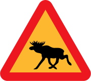
The principle of the European traffic sign standard is that shapes and colours are to be used for indicating same purposes. Triangular shapes (white or yellow background) are used in warning signs. Additionally, the Vienna convention allows an alternative shape for warning signs, a diamond shape, which is rarely used in Europe. The prohibition signs in Europe are round with a red border. Informative and various other secondary signs are of rectangular shape. Animals shown on warning signs include moose, frogs, deer, ducks, cows, sheep, horses, polar bears (on Svalbard), and monkeys (in Gibraltar). The Convention allows any animal image to be used.
Directional signs have not been harmonised under the Convention, at least not on ordinary roads. As a result, there are substantial differences in directional signage throughout Europe. Differences apply in typeface, type of arrows and, most notably, colour scheme. The convention however specifies a difference between motorways and ordinary roads, and that motorways use white-on-green (e.g., Italy, Switzerland, Denmark, Sweden, Finland, Slovenia, Croatia, Czech Republic, Greece, Cyprus, Romania, Slovakia, Serbia) or white-on-blue (e.g., Germany, the Republic of Ireland, France, United Kingdom, Spain, Netherlands, Belgium, Austria, Luxembourg, Poland, Portugal, Latvia). Hungary switched from white-on-green to white-on-blue in the early 2000s during the reconstruction of existing and construction of new motorways, although the first section of the M5 motorway built in the early 90s still has white-on-green signes.
Differences are greater for non-motorways: white-on-blue in Italy, Switzerland, Sweden, Czech Republic, Greece, Cyprus, Slovakia, Romania, Latvia, Finland and Netherlands (in this case the same as motorways), white-on-green in France, United Kingdom, Republic of Ireland, Poland and Portugal, black-on-yellow in Germany, Luxembourg, Norway, Slovenia, Serbia and Croatia, red-on-white in Denmark (though white-on-blue on motorway exits and all overhead gantries), and black-on-white in Spain.
Secondary roads are different from primary roads in France, United Kingdom, Finland, Republic of Ireland, Switzerland and Portugal, always signposted in black-on-white. In Germany, Italy, Romania and Sweden, black-on-white indicates only urban roads or urban destinations.
Signposting road numbers differs greatly as well. Only the European route number, if signposted, will always be placed in white letters on a green rectangle. European route numbers are not signed at all in the United Kingdom and are signed only on one recent scheme in the Republic of Ireland.
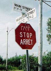
Some signs like "STOP", "ZONE" etc are recommended to be in English, but the local language is also permitted. If the language uses non-Latin characters, the names of cities and places should also be in Latin transcription. Road signs in the Republic of Ireland are bilingual, using Irish and English. Wales is also the same, with bilingual Welsh-English signs; some parts of Scotland also have bilingual Scottish Gaelic-English signs. Finland also uses bilingual signs, in Finnish and Swedish.
European countries use the metric system on road signs (distances in kilometres or metres, heights/widths in metres) with the notable exception of the UK, where distances are still indicated in miles, and on remaining finger post signs in the Republic of Ireland erected before 1977, where distances are also indicated in miles (which were formally used for all directional signage in the Republic of Ireland prior to 1977 and on speed limits prior to 2005). For countries driving on the left, the convention stipulates that the traffic signs should be mirror images of those used in countries driving on the right. This practice, however, is not systematically followed in the four European countries driving on the left, Cyprus, the Republic of Ireland, Malta and the United Kingdom. The convention permits the use of two background colours for danger and prohibit signs, white or yellow. Most countries use white with a few exceptions like Sweden, Finland, Iceland and Poland, as yellow tends to be more visible in areas in which snow is prevalent.
The European traffic signs have been designed with the principles of heraldry on mind; i.e., the sign must be clear and able to be resolved with one single glance. Most traffic signs conform to heraldic tincture rules, and rather use symbols than written texts for better semiotic clarity.
United Kingdom
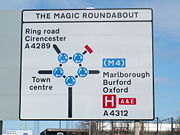
Traffic signing in the UK conforms broadly to European norms, though a number of signs are unique to Britain and direction signs omit European route numbers. The current sign system, introduced on 1 January 1965, was developed in the late 1950s and early 1960s by the Anderson Committee, which established the motorway signing system, and by the Worboys Committee, which reformed signing for existing all-purpose roads. (For illustrations of most British road signs, see the Highway Code website.)
Britain remains the only European Union member nation and the only Commonwealth country to use non-metric (Imperial) measurements for distance and speed, although metric "authorised-weight" signs were prescribed in 1981 and there is now a dual-unit (imperial first) option for restriction signage, used on safety grounds where foreign drivers may use the routes so that they may better understand the restriction and / or advice about a hazard ahead.
Three colour schemes exist for direction signs. A road may be a motorway (white on blue), a primary route (white on dark green with yellow route numbers), or a non-primary route (black on white). Most trunk roads, which carry most of the vehicular traffic and are owned by and maintained by the Highways Agency, other roads are maintained by local authorities, for example county or borough councils (borough councils are still subservient to the county in regards to highway matters but act as their agents in maintenance)
Two typefaces are specified for British road signs. Transport medium or Transport Heavy are used for all text on fixed permanent signs and most temporary signage, depending on the color of the sign and associated text color, white text on a dark background is normally heavy so that it stands out better. This is except for route numbers on motorway signs for which a taller limited character set typeface called Motorway is used.
Signs are generally in English although bilingual signs are used in Wales (English/Welsh) and are beginning to be seen in parts of the Scottish Highlands (English/Scottish Gaelic).
All signs and their associated regulations can be found in "The Traffic Signs Regulations and General Directions 2002".[5].
The Netherlands
Road signs in The Netherlands follow the Vienna Convention. Directional signs (which have not been harmonised under the Convention) always use blue as the background colour. The destinations on the sign are printed in white. If the destination is not a town (but an area within town or some other kind of attraction), that destination will be printed in black on a separate white background within the otherwise blue sign.
The Netherlands always signpost European road numbers where applicable (i.e., on the advance directional signs, the interchange direction signs and on the reassurance signs). Dutch national road numbers are placed on a rectangle, with motorways being signposted in white on a red rectangle (as an Axx) and primary roads in black on a yellow rectangle (as Nxx). When a motorway changes to a primary road, its number remains the same, but the A is replaced by the N. So at a certain point the A2 becomes N2, and when it changes to a motorway again, it becomes A2 again.
Signs intended for bike-riders always go on white signs with red or green letters.
The Dutch typeface, known as ANWB-Ee, is based on the US typeface. A new font, named ANWB-Uu (also known as Redesign), has been developed in 1997 and appears on many recent Dutch signs. The language of the signs is typically Dutch, even though bilingual signs may be used, when the information is relevant for tourists.
Sweden
The road signs in Sweden mostly follow the Vienna Convention with a few adaptations, however, allowed within the convention:
- the background of warning and propitiatory signs is yellow
- the warning signs of moose and reindeer
- the background of direction signs is blue with white text
- the background of motorway direction signs is green with white text
- when applicable, the language of text is Swedish in Sweden.
The signage typeface Tratex is used exclusively in Sweden and is available as freeware.[6]
Croatia
Traffic signs in Croatia are the same as traffic signs in the rest of the former Yugoslavia. Croatian road signs appear to follow the Vienna convention. The most common signs are yellow and black signs for direction, blue and white signs for information and white-on-green signs are used on the highways.
Ireland

Until the partition of Ireland in 1922 and the independence of Southern Ireland (now the Republic of Ireland) British standards applied across the island. In 1926 road sign standards similar to those used in the UK at the time were adopted.[7] Law requires that the signs be written in both Irish and English .
In 1956, road signs in the Republic were changed to markedly differ from the UK standard, with the adoption of U.S.-style "diamond" signs for many road hazard warnings (junctions, bends, railway crossings, traffic lights).[8] Some domestic signs were also invented, such as the keep-left sign (a black curved arrow pointing to the upper-left, although some are similar to the European "white arrow on blue disk" signs), while some other signs are not widely adopted outside Ireland, such as the no-entry sign (a black arrow pointing ahead in a white circle with a red slashed circumference).
Directional signage is still firmly based on the United Kingdom standard, however, with the basic design of directional signs remaining the same as the UK in most cases. The same colours are used for directional signs in Ireland as in the UK, and the UK Transport and Motorway fonts are used. However, signage in the Republic of Ireland is bilingual, with the Irish text in mixed case italics, while the English text is in all upper-case.

This also mostly refers to all the former republics of the USSR.
In January 2005 Ireland adopted metric speed limits. Around 35,000 existing signs were replaced and a further 23,000 new signs erected bearing the speed limit in kilometres per hour. To avoid confusion with the old signs, each speed limit sign now has "km/h" beneath the numerals. Also, since the adoption of signs based on the Warboys Committee standard in 1977, Irish directional signs have used the metric system, however, unlike with the later speed limit change over, there was no effort made to change the existing signage, and as of 2007[update] many finger posts still remain on rural roads with distances in miles, although the numbers continue to decline as roads are improved.
Iceland
Road signs in Iceland mainly follow the Vienna Convention, but use a variant of the colour scheme and minor design changes.
Latvia
Road signs in Latvia mainly of Vienna Convention regulations, only the design is different from many other European countries. The signs have many design issues common with Russian road signs since the times of USSR.
South and Central America
Road signs in South America and Central America vary from country to country. For the most part, conventions in signage tend to resemble North American signage conventions more so than European and Asian conventions. For example, warning signs are typically diamond shaped and yellow rather than triangular and white. Some variations include the "No Parking" sign, which uses a letter 'E' instead of 'P' (the Spanish word for 'Parking' is 'Estacionamiento'), as well as the Stop sign, which usually reads "Pare" or "Alto". Notable exceptions include speed limit signs, which follow the European conventions, and the "No Entry" sign, often replaced with a crossed upwards arrow.
Colombia
Traffic signs in Colombia are classified into three categories. These are Warning signs, Mandatory signs and Information signs.
Warning signs are very similar to warning signs in United States. They are yellow diamond shaped with a black symbol (the yellow color is changed to an orange color in areas under construction). In certain cases, the yellow color is shifted to fluorescent yellow (in the School area sign and Chevron sign).
Mandatory signs are similar to European signs. They are circular with a red border, a white background and a black symbol. Stop sign and Yield sign are as European, except the word “Stop” is changed for “Pare” and the Yield sign has no letters, it is a red triangle with white center.
Information signs have many shapes and colors. Principally they are blue with white symbols and in many cases these signs have an information letter below the symbol.
New Zealand
New Zealand road signs pull in two directions, following both American and European practices.
Warning signs are diamond shaped with a yellow background for permanent warnings, and an orange background for temporary warnings. They are somewhat more pictorial than their American counterparts. Regulatory signs follow European practice, with a white circle with a red border indicating prohibitive actions, and a blue circle indicating mandatory actions. White rectangular signs with a red border indicate lane usage directions. Information and direction signs are rectangular, with a green background indicating a state highway, a blue background for all other roads and all services (except in some, where directional signage is white), and a brown background for tourist attractions.
Before 1987, most road signs had black backgrounds - diamonds indicated warnings, and rectangles indicated regulatory actions (with the exception of the Give Way sign (an inverted trapezium), and Stop sign and speed limit signs (which were the same as today)). Information signs were yellow, and direction signage was green on motorways and black everywhere else.
Recognition
Opel Insignia will be the first production car to feature a dual-function frontal camera with traffic sign recognition.
See also
- Comparison of European traffic signs
- Exit number
- List of public signage typefaces
- Off-Network Tactical Diversion Route
- Rules of the road
- Street sign theft
- Traffic light
References
- ↑ http://www.gribblenation.com/gapics/gallery/i20w-exit60-natsiatka.jpg
- ↑ http://www.gribblenation.com/gapics/gallery/albany-exit2-3-natsiatka.jpg
- ↑ Illinois Department of Transportation
- ↑ 2006 Internet Templates
- ↑ http://www.opsi.gov.uk/si/si2002/20023113.htm
- ↑ Teckensnitt på vägmärken / Vägverket
- ↑ S.I. No. 55/1926: Road Signs and Traffic Signals Regulations, 1926 - Irish Statute Book
- ↑ S.I. No. 284/1956: Traffic Signs Regulations, 1956 - Irish Statute Book
External links
United States
- A gallery of strange signs from around the U.S.
- Manual of Traffic Signs – information on United States signs
- Part 2: Signs from the Manual on Uniform Traffic Control Devices
- Traffic & Road Sign Test – test your knowledge on U.S. traffic signs
Canada
- Government of Quebec traffic control devices library - Extensive list of all road signs and signals from the Quebec Transport Ministry (in French and English).
- Road Signs in Ontario, from the Ontario Ministry of Transportation.
European Union
- Signs and markings British traffic signs from the Highway Code
- Danish traffic signs
- Official French Government guide to road signs and signals (in French)
- Signs and signals in the European Union
Asia
- Indian Traffic Rules and Signals
- The Road User's Code: The Language of the Road by the Transport Department of the Government of the Hong Kong SAR
Typefaces
Other
- A collection of street signs and traffic lights
- Photos of directional signage on motorways
- Traffic signs in Croatia
|
|||||||||||||||||||
