Image:Sinc function (both).svg
From Wikipedia, the free encyclopedia
Sinc_function_(both).svg (42KB, MIME type: image/svg+xml)
| | This is a file from the Wikimedia Commons. The description on its description page there is shown below. |
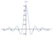
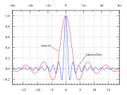
Graph of both the normalized (sin(πx)/(πx)) and unnormalized (sin(x)/x) definitions of the sinc function.
These are on the same scale. The second axis is just to clarify that the zero crossings occur on multiples of pi instead of integers.
[edit] Instructions
See Wikipedia graph-making tips.
Generated in gnuplot with the following script:
# Set 1300×975 SVG output and filename
# The font size (fsize) sets the size for the circles, too.
set samples 400
set terminal svg enhanced size 1300 975 fname "Times" fsize 36
set output "sinc function (both).svg"

# Set y axis limits so the plot doesn't go right to the edges of the graph
set yrange [-0.3:1.1]
set xrange [-6*pi:6*pi]

set lmargin 5
set bmargin -5

# No legend needed
#set nokey

# Add lightly-colored axis lines
set yzeroaxis
set xzeroaxis

# Put a y-axis tic at every 0.2
set ytics 0.2
set mytics 4

# Put an x-axis tic at every integer
set xtics 5
set format x "%2.0f"
set mxtics 5

# Put a second x-axis tic at every multiple of 2*pi

set x2tics 2*pi
set format x2 "%2.0f"
set mx2tics 2
set grid x x2 y
set xtics nomirror

# Format tics as digit with one decimal place
set format y "%2.1f"

# Plot as lines
plot sin(x)/x with lines, sin(pi*x)/(pi*x) with lines

# Close the file (so I don't have to close gnuplot to view it)
set output
Then I opened the resulting SVG file in Inkscape, copy and pasted the Unicode π characters and modified those labels by hand, changed the line colors, brought the plot lines to the top, made all the lines 3 px wide, made the grid lines 2px wide and 50% transparency. I also manually reconnected the grid lines that were cut by the legend function, moved the legends down next to the graph, converted their example lines into directional arrow type lines, and put a white box behind the text instead of trying to cut the graph lines like gnuplot does.
[edit] License
Source: Created by User:Omegatron using gnuplot, possibly with post-processing in the GIMP (PNG) or Inkscape (SVG)
|


